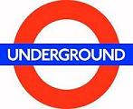
a great, under rated logo turns 100
I’ve never been to London but I know the logo for London’s Underground. With a tip of the popular audio’connell baseball cap to designboom for the head’s up, the logo (whose shape turns out to have a proper name: roundel) was the work of the late arts and crafts calligrapher Edward Johnston in 1917. Architect Charles Holden began incorporating Johnson’s sign design within the distinctive underground stations Holden designed from the 1920s.
This is a great example of why I love the internet, blogs and RSS. I wasn’t thinking about any of this before I read it this morning but now I am so pleased that I know it.
Yes, I am a geek but you don’t have to point it out to me 😉


Congratulations for the great blog dude… Btw, have you tried this for logo creation?