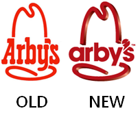
arby’s new logo – this time, it’s personal!
Since about the age of 18, I have been an ardent supporter of Arby’s.
At UD, many days I would eat there for breakfast lunch and dinner and I still lunch there occasionally. So with all the money I have poured into the place, I have an unofficially vested interest in any branding change, regardless of your opinions of my eating habits.
So when I saw this hideous excuse for a logo change, I asked why? I asked it for two reasons.
1. The current logo describes very nicely the food and ambiance of the stores, especially the newer stores.
2. The new logo looks like crap. I tried to be more artful than that but words failed me.
The new logo is crap and it doesn’t matter what their new branding direction is – if the chain is not going to be Arby’s, then change the name and menu and move on. But if you plan on remaining Arby’s, true to the iconic nature of your brand (build with comparatively little branding vs. it’s main competitors in the fast-food area) then tweak the logo if you must.
Keeping the hat and changing the word mark in this way is more than a tweak, it’s a bastardization and if I was a franchisee with the looming costs involved in changing signage to this new craptastic logo, I would be pissed!
You can offer a differing opinion, but you’ll be wrong! 😉


…again, the dreaded “new and improved”…and completely unnecessary…rears its ugly header.
Rowell I could not agree more!!
Best always,
– Peter
It has lost its “western/cowboy” charm (not that a REAL cowboy would eat at Arby’s) and looks like a kiddie cartoon. Maybe you are not their demographic anymore! =:O
[…] has been noted in this space, I am a fan of Arby’s (though not of their new, hideous logo). So it was there last Friday I found myself having a pleasant lunch alone watching ESPN and […]