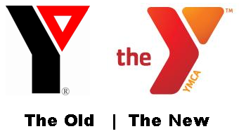
the new y
OK, so the YMCA is in the news for updating their branding and that includes a new logo. I haven’t done a logo post in a while, mostly because I’m probably the only person that enjoys such conversation but in case you find this a fun diversion, here goes:
I have not yet read (as I write this post) the branding statement that the YMCA (or more likely its design agency) has put out describing the logo. Just by the way, I’m usually uneasy about these logo “explanations”; I understand the desire to offer some text clarification to an icon but usually these descriptions sound awful poofy.
So here is my initial opinions of the new mark…I hope YOU will chime in too with your own thoughts, just for the fun of it.
* Overall, I like it better than the old mark but I never really disliked the old YMCA logo
* I would not have gone with that color combination. With me and color, if I wouldn’t normally wear colors together, I think I’d rarely put them in a logo together (especially true of a 2 color logo)
* I wonder if the branding people are going to allow/encourage changes in color of the logo to visually represent the diversity of people who use the Y. That could be a nice creative touch – it could also lead to branding nightmares but that’s not my problem 🙂
* The main stem of the Y I think was designed like the play symbol on most audio and video devices (>) to mean play, go, move forward….all reasonable ideas to include for a YMCA logo
* I’m guessing the triangle part of the Y has some heritage meaning since it was a hold over from the old logo. I’d be interested to see if my guess is right
* I think the “the” in the logo is unnecessary. I know the new branding is about just calling the organization “The Y” instead of YMCA but as the organization has noted, people already call it “The Y” and have been doing it for years
* The YMCA at the bottom of the Y is fine
Of note, I have had my very first experience with the Y only this past weekend as my oldest started taking swimming lessons there.
OK, so now let’s look at the Y’s web site and pick out some logo tidbits from their release:
* “The Y’s former logo had been in place since 1967 and was the organization’s sixth since its inception.”
* “Today, across the United States, Ys are making a difference in three key areas of focus:
* Youth Development: Nurturing the potential of every child and teen
* Healthy Living: Improving the nation’s health and well-being
* Social Responsibility: Giving back and providing support to our neighbors”
Editors Note: While it does not reference it directly, I think these three points tie into the triangle part of the logo I mentioned earlier.
* “The refreshed logo, with its multiple color options and new, contemporary look, better reflects the vibrancy of the Y and the diversity of the communities it serves. The new logo’s bold, active and welcoming shape symbolizes the Y’s commitment to personal and social progress. ”
Editors Note: Well, as far as poofy goes, that wasn’t too bad. It mentions multiple color options so I may have locked on to something there (remember my diversity comment; I grabbed some of the variations off the web site). Talks about progress, hence the forward pointing Y stem. If you’re scoring at home, I did OK on this one
What say you?


