
the polls are now open

As audio’connell Voice Over Talent has opened its division, International Voice Talents (which strangely enough offers professional voiceover services from…international…voice…talents, get it?) we needed to kick up the branding a bit.
Its logo time.
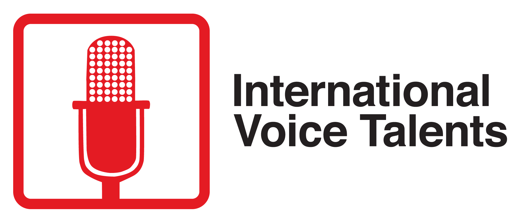
The goal of this logo design was to mimic some international signs with their abstract iconography; the good news was that many of those signs use the colors red, white and black as does audio’connell Voice Over Talent and Voice Over Workshop (see, we were destined to do this international voice thing!)
Place your vote below in the comment section including whether you’re picking the logo you love or the best of the worst. Voting is open to anyone so tell your friends…but hey, vote only once please.
Certainly branding is hard work but nobody said it couldn’t be fun!
(Click on icon for full view)
CHOICE A
CHOICE B

CHOICE C

Thanks for reading.
If you haven’t already, we’d be honored if you subscribe to voxmarketising – the audio’connell blog and podcast by clicking the “subscribe” button on this blog.
If you really like this post (of course we hope you do), please feel free to bookmark and or promote it by clicking the buttons below on your preferred services.

Moe:
Excellent choice! Thanks for voting.
Best always,
– Peter
“A” wins for me. I feel that it best fits the “abstract iconography” style of international signage. The others are not only too detailed, as Moe mentioned, but too realistic, mainly in terms of the implied dimensionality of the mic. Most international signs that I recall have had more of a flat feeling, and “A” works best along that line.
Justin:
I enjoyed your reasoning on your vote. Thanks for participating
Best always,
– Peter