cleveland fumbles the brand
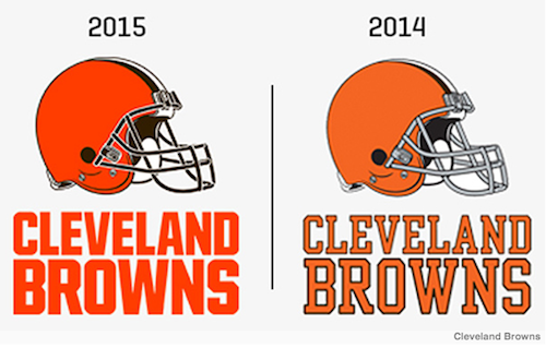
ESPN reports the Cleveland Browns have updated their primary logo.
Voxmarketising reports all the Browns really did was put lipstick on a pig.
Tell me, tell me I dare you, where are the oohs and aahs in this big brand change? A new panatone orange and a brown facemask? A better typeface?! Well OK, the typeface IS better.
Forget imagery for a second….do you know how much it costs to change signage and imagery for any big business, let alone an NFL franchise?! Millions of dollars! Millions….for this crap?!
Back to the imagery, the brand, the look. Supposedly the uniforms will be updated in April and will compliment this new helmet. No, no they won’t. Only a brown paper bag will compliment this helmet and that has been worn before many times at Cleveland Browns games (pretty big talk coming from a long suffering Bills fan, I’ll grant you).
The Browns team president noted the helmet IS the logo for Cleveland and with it’s rich, storied tradition blah, blah blah the city would implode if the Browns changed the helmet to include a new logo (well, he didn’t say that exactly).
No, no the city wouldn’t implode but the city of Cleveland should be pretty pissed off if this is the result of two years worth of NFL branding research. Clearly, the Cavaliers and the Indians are the modern sports leaders in Cleveland.
‘Put a fresh coat of paint on the logo and call it new’ is not what a city like Cleveland deserves or needs. It says alot that a new secondary logo for the “Dawg Pound” comes across as more professional than the team’s main logo which, again, is a helmet.
A football helmet. That’s the logo. THAT’S what passes for creativity in Cleveland. There is a pretty terrific creative arts community in Cleveland and they have got to be collectively screaming “WTF!” Again.
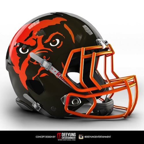
I didn’t know the Browns were focusing on a branding change before I read the ESPN story. Yet, some weeks ago when the internet started to go crazy for a bunch of unsolicited helmet designs from a company called Deeyung Entertainment, I was totally wowed by Deeyung’s Cleveland Browns helmet design. It really stood out to me at the time.
A mean-ass dog perched, waiting for you in the shadows. THAT’S football imagery. That screams toughness, meaness, FOOTBALL for God’s sake!
The logo says ‘Our offense will run all over your defense. Our defense will chew up and spit out your offense.’
People don’t get bit by Tigers, Lions and Bears much but more than a few people know what it’s like to get bit by a mean dog. That’s a logo that speaks to your football audience.
You put a paper stick underneath the Browns’ ‘new’ 2015 helmet design and you’ve got yourself an ORANGE TOOTSIE POP! That’s not football! What a missed opportunity for a brand with unlimited potential. Oy!
So I guess I’ll summarize by making a declarative statement. I don’t like the new Cleveland Browns logo. 🙂


