Entries Tagged as 'marketing'

The Greatness of the Greenville Yard Gnomes and Minor League Baseball Logo Design

From a logo design perspective (and you know I love me some logos), few things make me as generally happy and excited a Minor League Baseball logos.

Which is why I was so excited to hear about the Greenville Yard Gnomes.

Greenville Yard Gnomes Baseball 2024 CPL

The new logo for North Carolina’s Greenville Yard Gnomes, who begin their first season in the Coastal Plain League on May 24, 2024 at Guy Smith Stadium

Yes…that is a baseball team, a very new baseball team and I am here for all of it (even though Greenville is 90 minutes away and I may never get to a game). I’m all in on the Yard Gnomes.

I’ll tell you why in a minute but first a not-brief-enough explanation on baseball leagues for non-“sportsball” people, (and look, I like baseball but I don’t follow/live/die baseball – an MiLB game is a great night out for me #goBuffaloBisons #goDurhamBulls #goCarolinaMudcats).

For those who don’t really follow baseball, they may only know the Major League Baseball teams (MLB) – like the New York Mets or the Los Angeles Dodgers…the teams that play for the World Series and get most of the attention. Even non-sportsball people will recognize these and other MLB names.

These MLB teams ALL have farm clubs…a kind of feeder system of players and coaches for the MLB make up teams in the Minor League Baseball system (MiLB). In this system, there are ranked MiLB leagues of teams from lowest (Single A) to highest and closest to the MLB (which is Triple A). Below that that are a series of much smaller leagues that I refer to as Development Leagues (I’m sure there’s a better name but I’m trying to get to logos here, people!!) šŸ™‚

So, as to why I’m all in on these non-MLB teams?

These MiLB farm clubs and smaller teams, in my opinion, have to work especially hard to gain attention in their communities to get people to come to the games and for advertisers to spend money.

There is sooo much creativity that goes into MiLB and Developmental League gameday events, preparation, sponsorship (maybe broadcasts if they are fortunate). But to me it all starts with two things for an MiLB or Developmental League team to get a good start and be able to build a franchise: team name and logo.

The team name and logo set the stage for everything that comes after it.

The name has to resonate with the community (historically, geographically, comically – take your pick or mix & match). The name or a nickname has to be something the fans will be able to proudly scream and cheer for. The icon colors need to tie in with the community or be really smart looking. Of course the logo itself needs to grab the community for so many reasons, not the least of which is merchandise sales.

Not sure?

Lehigh Valley Iron Pigs BaseballGo ahead and TRY and tell me you’re not the least bit curious about a baseball team called the Lehigh Valley IronPigs, the Biloxi Shuckers, the Lansing Lugnuts or the Fort Myers Mighty Mussels.

You’d be lying. Don’t lie to me!! šŸ˜‰

So when I hear about a new, non-MLB baseball team, I know all the work, blood, sweat and tears (and often not great salaries) that went into the work (and will go into future work) to get the team’s branding right.

Which leads to this morning’s revelation (at least it was a revelation to me) that North Carolina is getting a new baseball team as part of one of those Developmental Leagues I spoke of…this team is the Greenville (NC) Yard Gnomes.

#GoGnomes (I made up that hashtag…not sure if it will stick).

Coastal Plain LeagueThe Yard Gnomes (which I imagine may start to be referred to by fans as the YG’s (pronounced “whygeez”, one word)) are now part of the Coastal Plain League (CPL), which is a collegiate summer league, featuring top-notched college players from across the nation. The CPL features 15 teams across Georgia, North Carolina, South Carolina and Virginia. Many of the CPL teams play in former minor league stadiums and cities, as well as in newly constructed stadiums that meet Class A standards. Capitol Broadcasting Company, a Raleigh-based broadcasting, sports marketing and real estate company bought the CPL in 2022.

It’s such a small league that, as of this writing, the CPL web site hasn’t even posted the YG’s new name & logo (Capitol Broadcasting has). No blame here, these minor-minor league leagues are often severely understaffed.

These are a collection of college players traveling across the South in summer, with players often living in the homes of local team fans who sponsor them with living quarters (players paying maybe a small fee) for the season. These players also have other jobs. The players need to really LOVE baseball because out of about 1,700 players, on average only 10% of them make it to the majors.

Peter K OConnell Holly Spring Salamanders Baseball

Raleigh-based voice actor Peter K. O’Connell – who really enjoys any night at a minor league baseball park – proudly models his Holly Springs Salamanders baseball cap from ’47 Brand. Holly Springs is a suburb of Raleigh, NC, The new (for the 2024 season) Greenville Yard Gnomes will be in the same summer baseball league as the Salamanders.

These facts I learned some years ago at a game of a sister CPL team to the YG’s, the Holly Spring Salamanders (and yes I have a Salamanders hat – of course it’s a ’47 Brand Cleanup — my favorite!!).

So all of that – the branding, the small staffs, the low budgets, the house rentals, the blood sweat and tears all went into kicking off this new baseball team in Greenville.

And the team name and logo are awesome. Fantastic! I love it. Why?

The Yard Gnome name, just as a guy on the outisde looking in to a market/community I do not know much about, is unique, quirky and fun. The name brings a smile. This to me is a VERY good start and memorable for a league whose average game attendance seems to hover around 1,000 on its best nights.

ECU Pirates Athletics

The Yard Gnome logo is cute, charming and whimsical…like yard gnomes (unless your neighbor has, like, a thousand of them in the front yard).

The CPL has created a brand story to tie in the legend of gnomes with Greenville’s East Carolina University’s Pirates and some of the history of baseball in Greenville to make it all flow.

Brian Begley Graphic Designer NJ

The Yard Gnomes logo was designed by Brian Begley, a New Jersey-based artist, who is know for his ability to blend historical and contextual elements with a clean, simple style.

The YG’s will enjoy their inaugural Opening Day on Friday, May 24 against the Tri-City Chili Peppers at Guy Smith Stadium, their new home.

voiceover workshop invited on the “ask me anything” webcast with tom dheere

Tom Dheere & Peter K. O'Connell "Ask Me Anything" Voiceover MArketingI’ve been fortunate to be invited on a number of voiceover related podcasts and webcasts (because the ‘cooking show’ podcasts know I don’t really have that much to offer – as I am a Platinum Member of the Arby’s Best Customer Club).

So it was nice to have the VO Workshop invited on Tom Dheere’s “Ask Me Anything” webcast (part of his VO Strategist business) to discuss voice-over marketing.

Full disclosure, I was not his first choice for the show but his original guest had to cancel last minute. Glad to help out my friend of at least 10+ years just before airtime.

The show must go on! Indeed it did!

We spoke about marketing priorities for voice talents including databases, demos, websites and more. We also took questions from viewers of the live broadcast.

According to Tom, the show went very well. As the guest, I know hosts always say that but the response thus far has been very positive. I know I enjoyed myself.

Hope you enjoy it.

donā€™t take your voiceover web pages for granted

Voiceover Workshop Peter K. O'Connell voworkshop.com

This is the graphic I created and added this weekend to freshen up the content on VOWorkshop.com

Wait a minute…donā€™t ignore that headline about voiceover web pages because you KNOW you do it.

Everyone who has a website usually works really hard at the start to make sure the design and content are current and laid out well and pretty. Oh how hard we work on it!

Then…we ignore it for many months and even years. Donā€™t deny it, yes YOU do!

As usual, I will throw myself under the bus in this regard — but I know this isnā€™t just me.

During this weekend, I found myself cleaning up and adding some content to my main site, peterkoconnell.com (also found via audioconnell.com). I had new information to add to some website pages, some new posts that will be added automatically in a few weeks to the main site and blog etc.

But when I looked at the website interface on all my many voiceover web pages, I realized I had not updated page for the Voiceover Workshop (found via voworkshop.com) in years. Plural! As in more than 1, 2 or 3 years. I’m still teaching all the VO stuff to the VO peoples šŸ˜‰ but I hadn’t touched the web page in far too long.

Did that information change much? No…but I know it is valuable to keep refreshing a web page’s information at least a little every year..and itā€™s not that hard.

So to the Voiceover Workshop page, I updated some text and added a fresh, colorful graphic…simple. Now Iā€™m happy with the refreshed page and Google is even happier

Mr. “Marketing Guru” (not at all, really) ignored his own oft quoted advice. Ok, itā€™s humbling and it should be for me.

But now, you can learn from my…well, not really a mistake…from my omission or neglect.

Take a look at the active pages of YOUR voiceover web site. Make an appointment with yourself…set time aside.

Sometimes you will not have to change anything…but sometimes there are reasonable and useful changes in text, graphics, headlines, alt tags or keywords, etc, that you should make. Itā€™s easy but necessary stuff to do to keep voice actor website information fresh for prospects, customers and Google!

Voiceover Workshop website is your store voworkshop.comMy simple advice is donā€™t take website content updates for granted…try and schedule a 6 month or 12 month check-up with yourself. Be accountable to yourself.

Remember, in voiceover, your website is your store…and your store should be swept, dusted, vacuumed and/or mopped more than just every few years.

voiceover business cards: a moo-ving story of getting it right, eventually

Turns out the third time was the charm for this edition of how the voiceover business card turns!

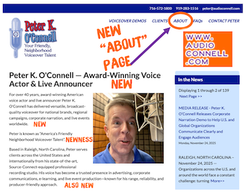
So, as I noted in an earlier post, I updated my voiceover branding to highlight my ā€œYour Friendly, Neighborhood Voiceover Talentā€ positioning. Along with a logo redesign and website update, news business cards had to be created.

As a few of you may remember, I do like my business card design posts…so do many of my voiceover blog readers. Business cards are a great creative opportunity to not only share contact information but also to become memorable among your prospects.

Thatā€™s especially true for voice actors who need to show a dash more creativity in our branding because many of our prospects and clients work in design and advertising and they notice that stuff!

This story of my new business cards will focus less on the actual design (although that will play a part in the story). This voiceover business card story will tell a tale of the printing of the business cards. And the printing of the business cards. Then finally, the printing of the business cards.

Having sent the design of my new cards to my graphic designer, I had to pick a style of card (thereā€™s lot of them…with different corners, paper stock and coatings…oh my!). To print them, I decided to go with the on-line printer Moo.com.

By way of a little background, I had really gone all out on my last business card design. I found a company that printed plastic business cards that were very well received by all who got one. Such nice comments.

But plastic business cards presented a couple of issues, I realized over time.

One is that plastic business cards are VERY expensive. Also, I carry some business cards in my wallet and there were times when I went to hand one out and the cards had rubbed to together, get super smudged and they looked awful. I wasnā€™t about to carry a separate business card holder with me everywhere so the scratched and smudged expensive business cards were a costly annoyance for me. Finally, business cards feel like they are become a less necessary tool as so many connections are made virtually vs. in person.

So no plastic cards this time. Moo has this really nice, super thick paper stock that I thought would work really well. It even has color on the edges of the card. I was sold. My graphic designer gave me the setup design to upload and we were off!

Well it turns out…we were way off. My designer submitted the business card art with crop marks that most printers use. Moo did not want or like the crop marks. So the printed business cards came out showing some of those hash marks.

To Moo’s credit, their quality control caught the mistake and notified me that the cards with the crop marks had shipped but Moo said they could fix the issue and would reprint free of charge.

Before the ā€˜fixedā€™ cards arrived, I received the crop marked cards. Turns out the crop marks printed on the finished business cards were not the only issue these cards had. On the back of the new cards, I used a blue background. I found that the blue ink smudged pretty easily when I put some of the crop marked cards into my wallet to see how they fit.

Oy, here we go again…the expensive plastic cards had color smudging and now the new heavy thick paper cards have the same problem.

A little later, the ā€œfixedā€ cards from Moo arrived. While Mooā€™s “fix” had removed the crop marks it also threw the design way of balance because they basically tried to ā€œzoomā€ in to get rid of the crop marks. It was a bad look. These cards werenā€™t going to work either.

Something good did come of these printing errors.

I decided that the back of my card design was actually way too busy. My fault. I had inadvertently thrown the kitchen sink at that part of the design; yes cards were functional with all the information contained but the design (its function) was too cluttered.

Maybe the printing error was my graphic designer Guardian angelā€™s way of saying ā€œtry again, kiddo!ā€ Indeed I would.

I decided in the redesign to go for mostly white in color…front and back…to cut down on the opportunity for smudging. Also I cut down on the words and made the fonts a little bigger and easier to read. I decided to go away from the thick paper stock and go one step down to Moo’s less thick but coated card stock. Hopefully this would lead to no or less smudges and scratches. It’s a wallet causing the issue so it may never be perfect.

With the new design done and formatted the way Moo.com liked it, their customer service person confirmed the designs met their standards and the art was uploaded for printing.

A few days later, I got THIRD version printed business cards. Inexplicably, these newest cards had printer cut lines on them and a black line at the bottom. None of these markings were on my submitted artwork.

Oh and about the rounded corners I had ordered…there were none…all 90 degree angles.

It was a production problem, I was told.

At this point, I had to speak with a Moo.com manager. It was too much and too sloppy.

I need to note that all the Moo.com customer service people I emailed with and spoke during this process with were all very nice and professional.

But I expressed my understandable frustration to the manager who not only credited me for the whole order, reprinted my cards, had them hand inspected and shipped over night (all at no charge) but also gave me a credit for future orders. Aside from paying off my mortgage, they was nothing else they could have done for me so I was satisfied.

Today, I got my cards…as I wanted them. Simple, understated & functional yet attractive and a bit of “oh hey, these feel nice!”

Business cards are hardly the most critical part of a businessā€™ marketing efforts…but they ARE a part of it. They need to look the way they are supposed to look.

Now they do.

Be patient with your vendors, be patient with yourself…on business cards or any aspect of running your business.

Enjoy the ride.

pepsi has a new logo and its meh

While Pepsi-Cola unveiling a new logo this week, I feel I must address this news for a multitude of reasons including:

  1. Although it is not healthy, Pepsi has always been my favorite soda
  2. Now that I live in North Carolina, where Pepsi was created, itā€™s kind of a civic requirement to address this logo redesign
  3. There hasnā€™t been this kind of big logo news in a while
  4. Itā€™s also a slow news day

So when Pepsiā€™s current logo was unveiled about 10+ years ago, it was a pretty big change to the font and the emblem from previous logo incarnations. Then it was revealed that the design agency of that logo crafted this huge brief about what all the geometry of the emblem meant and the reasoning for it and it was…a level of design hogwash that only accounts receivable managers at Ad Agencies could love ā€“ billable by the hour!!! Ridiculous!!

This new design moves pretty far away from today’s current icon. This new design has some fresh design elements of its own but also relies on beloved elements of historically more recognizable Pepsi logos.

The new 2023 design brings back the emblem design familiar in two old logos used from 1950-1997 while also bringing back the black font color used in the logo circa 1950-1986.

The biggest change is the font style of the word itself, Pepsi. The new word mark, which currently resides within the red, white and blue Pepsi emblem (as it had in some past Pepsi logos), is a bold, all caps customized font in black. Itā€™s probably my least favorite part of this new logo.

Itā€™s not the weird cut of the ā€œIā€ in Pepsi that I dislike so much as the font design of the two ā€œPā€ā€™s in Pepsi. They barely look like Pā€™s as much as improperly drawn Dā€™s whose rounded front couldnā€™t quite make it all the way down to bottom of a Dā€™s vertical base. Taken together, the letters of the word mark look disjointed, mismatched and not great.

Over all, Iā€™d give this logo redesign a grade of C, as in the first letter of Coca-Cola…who has an iconic scripted logo that will always be more iconic that anything Pepsi could ever create.

Pepsi still tastes better than Coke.

doodling leads to inspiration for new logo

Peter K O'Connell Your Friendly Neighborhood Voiceover Talent

It is possible that in another life I wanted to be a graphic artist.

While voiceover is what I love (and I have some abilities), I enjoying playing around with graphic design and fonts (certainly my efforts would not qualify as ‘having abilities’).

Peter_K._O'Connell Voiceover Talent Logo Scripted font

The 2016 logo for “Peter K. O’Connell Your Friendly, Neighborhood Voiceover Talent” featured a more prominent position for the voice talent’s name and added the blue colors more commonly associated with his new home state of North Carolina

While I have designed all the logos I have used for my companies, I require the skills of a much more talented graphic designer to bring them to life. Thank God for her and her patience with me.

So why did I create the new logo in March of 2023?

When I moved down to Raleigh from Buffalo in 2016, I knew I wanted to update my voiceover logo and colors to reflect my new area (hence the move to blues and away from the original red and black). Plus, I never felt I really made my longtime tag line “Your Friendly, Neighborhood Voiceover Talent” LOOK friendly enough.

Also at the time, I correctly believed I needed to focus a bit more on the “Peter K. O’Connell” part of my brand as people sometimes didn’t understand that it was ME doing the voice work.

“So I get it’s your company (audio’connell) but who does the actual voiceover work?” Um. Uh. Me. I…do the, uh, voiceover work. For many decades now.

Awkward.

Yes, my name is the name of the product I’m selling (me) but I have always been self-conscious about it. It’s a conundrum – not wanting to promote yourself yet you are the brand..so you kinda have to promote yourself. It’s complicated.

The challenge about that prominent name placement in my logo was/is that it didn’t and never has felt natural and comfortable to me. I have always been self-conscious about the necessary evil of self-promotion in my voiceover business but in recent months, the name part just became personally annoying.

40th Voiceover Anniversary Peter K. O'Connell

A version of the “Peter K. O’Connell Your Friendly, Neighborhood Voiceover Talent” logo modified for the male voice actor’s 40th year in voiceover

From a business marketing perspective, this may be one of the stupidest reasons to change a logo…what if the rest of the world likes the logo just fine? Why ruin a good thing? What if they hate the new logo. Stop changing things!!!

And then the self-loathing question…does anyone else really care or notice the “Peter” logo? Or ANY of your logos? (Geez, here we go….).

Anyway, that’s where my head was at for a long while.

So one night, not thinking I would be changing a logo and not actually focused on that thought, I was playing around with some fonts….and I hit on one that I thought really looked sharp when it spelled out “Your Friendly, Neighborhood Voiceover Talent”. It gave me a nice endorphin rush as I arranged the letters and words.

Ooooo, that’s a good sign. A design that was more about the “Friendly” and less about “Peter”.

But the design needed something else…and I remembered my great RCA-77 microphone that was part of a popular audio’connell logo from years gone by. When I added that mic to the words, the logo clicked for me. I slapped my name domain (peterkoconnell.com) at the bottom, readable but not prominent and I immediately felt more at ease.

Conscience relieved. Branding served. Win, win.

Then I showed the draft of the logo to a person whose opinion I respect…they liked the logo but didn’t think the font I liked was particularly “friendly”.

I tried to brush that comment off…of course the font was friendly.

Of course…it….was.

And I was about to get ready to finish the logo with the maybe-not-as-friendly-as-I-thought font when I got an email.

I believe in signs and this email had to be a sign.

It was a email announcing some new fonts from a type foundry and the email had in it a very friendly looking font.

I thought “she’ll kill me for making ANOTHER change” yet I sent the new friendlier font over to my designer anyway and she set it up.

Ooops.

Somehow the friendliness of the new font didn’t translate into the logo. The font looked kinda short and fat and frumpy.

I was a bit sad about it. Wasting time, wasting money. Oy!

Then I asked the designer, in a last ditch effort on my part, to squish inwards the left and right sides of the word mark together to see how it looked that way, a bit taller, hopefully?

Peter K. O'Connell Your Friendly, Neighborhood Voiceover Talent Logo 2023_png

The 2023 version of the Peter K. O’Connell Your Friendly, Neighborhood Voiceover Talent Logo

Bingo. The word mark looked taller, sharper & friendly. That’s what you see now. Many endorphins. A fireworks of endorphins. It was done.

As much as I like the new logo now, I cannot guarantee that in another 7 years, I won’t change it again.

Because it is possible that in another life I wanted to be a graphic artist.