Entries Tagged as 'branding'

What “About” Us?

Peter K. O'Connell Voiceover About Page 2026Let me start with a confession that every solopreneur in the voiceover industry will understand: writing about yourself is excruciating.

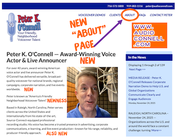
I just published a completely revamped “About” page at audioconnell.com. It was one of the hardest web pages I’ve ever written. Not because I don’t have 40-plus years as a professional voice actor to draw from. The awkwardness comes from having to sound braggadocious. Listing campaigns. Name-dropping clients. Talking about awards and testimonials from people in the business.

Ick!! That’s just not who I am.

But here’s what pushed me to finally revamp this page on my website and update this content: the way casting directors find voice talent has fundamentally changed. Traditional search engine optimization isn’t enough anymore because people aren’t just googling “voice actor” and clicking through links.

They’re using voice search and asking AI assistants conversational questions like “Who’s an experienced automotive voice talent with Source-Connect in North Carolina?” and getting direct answers. If your content isn’t optimized for AEO (Answer Engine Optimization) and GEO (Generative Engine Optimization), you’re invisible to this growing search method that’s adding millions of sessions monthly.

The Uncomfortable Truth
Here’s my struggle: how do I mention that I voiced the Maaco “Uh-Oh, Better Get Maaco” campaign without sounding like I’m showing off? How do I talk about being character voices for Kraft Dinner or doing the Crest “Pro-Active Defense” commercials without feeling like a braggart? How do I highlight my corporate narration and live announcing work without coming across as self-important?

But then I realized: casting directors aren’t reading “About” pages anymore. They’re asking ChatGPT. They’re using Perplexity. They’re having AI tools create shortlists based on specific criteria and user intent. If your website content (like this reconstructed “About” page) doesn’t answer those natural language queries with clarity, you don’t make the shortlist.

The Part That Made Me Squirm
You know what was worse than listing clients? Showcasing testimonials. Geez!!!

Don’t get me wrong, the clients who provided them are lovely and were genuinely happy to contribute. But having to originally request them felt so cringe. Posted them on a “Client Testimonials” page…ack!!!

Now I’ve got to put some of them on my “About” page on top of my testimonials page because that’s what content strategy demands in 2025???? Feels rather clownish for me.

BUT it’s the craziness of how internet search works now. You need authoritative sources and third-party validation scattered throughout your site because AI systems are looking for that confirmation everywhere, not just in one spot.

Something about it still makes my skin crawl. Like stepping on a wet bathroom floor in socks.

The Structure Question
I wrestled with how to organize everything to make AI happy (because evidently that also now part of my job description). Do I lead with my origin story? Do I jump right into the client roster? How do I structure my explainer video samples and voice of god demos?

I finally realized the answer: both. But in scannable sections with clear brand messaging that work for human readers and AI systems alike, optimized for featured snippets and question-based queries.

Why I’m Telling You This
I’m writing this because I know a lot of you are in the same boat I was in.

You know your old “About” page is outdated. You’re not doing any (or enough new) SEO copywriting or content creation to improve your organic traffic. But the thought of writing about yourself, of listing your achievements, of including client testimonials makes you deeply uncomfortable.

I get it. I felt/and still feel/ exactly the same way.

But here’s the truth: if casting directors and producers are using AI tools powered by large language models to research voice over talent, and they are, then your discomfort with self-promotion is literally costing you work.

The page is live now at audioconnell.com/about.

Check it out. See how I handled the awkwardness.

See if it helps you think differently about your own site’s content optimization.

And if you’re still struggling with the braggadocious feeling? Remember: it’s not bragging if it helps the right people find you for the right projects.

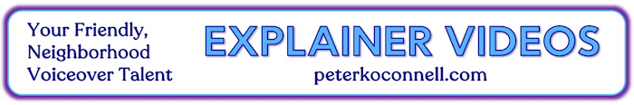
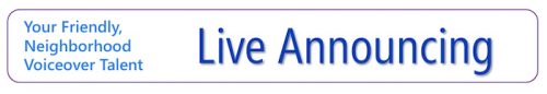
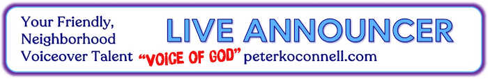
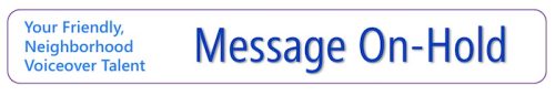
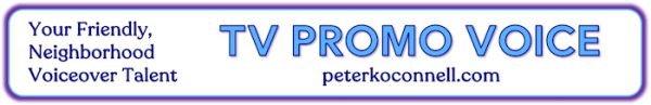
Peter K. O’Connell is an award-winning professional voice actor, live announcer, and voiceover coach based in Raleigh, North Carolina. For over 40 years, he’s been “America’s Friendly Neighborhood Voiceover Talent,” delivering versatile, broadcast-quality voice over for national brands, Fortune 500 companies, and live events worldwide. Connect with Peter at audioconnell.com.

Peter’s Source-Connect Logo Design & Voiceover Housecleaning

Peter K. O'Connell Old-New Source-Connect Icons

Unless I told you, you’d never notice.

But I’m telling you anyway because (a) it’s funny, and (b) it involves me making fun of myself—which is always a crowd-pleaser around here.

So, here’s the scoop: Source-Connect (a must-have software in pro voiceover and audio recording studios like mine) updated their logo design.

Why care?

Because Source-Connect is the industry standard for real-time, high-fidelity remote audio recording. It’s how voiceover studios like mine connect with producers worldwide. The “Standard” version—yes, that’s literally the name—is what most serious voice talent use.

Now, the Source-Connect team? Brilliant at software. Less so at logo design — but who cares because the software rocks.

But the branding does make a difference to me because I use a co-branded Source-Connect-audioconnell icon across my website to:

  • Show I have the software (which makes audio producers happy)

  • Show I have the Standard version (again, happy audio producers)

  • Show my Source-Connect username so clients can find me easily (happy, happy, happy)

Old Source-Elements / Source-Connect logo for "Standard"

Old Source-Elements / Source-Connect logo for “Standard”

The old S-C logo not awful, it was just “meh,” and the new one? A green dot and san serif font. Not awful. Just… bland again. More minimalistic I guess.

But, if S-C changed their look, I had to update mine for my website.

A small request to Source-Connect HQ: Could you PLEASE offer downloadable logo buttons in various formats? Save graphic designers (and fake ones like me) from reinventing your branding. There are a variety of us who have created these icons for our website…wouldn’t it be better if it was all at least a little bit unified?

Well time for me to go full graphic design DIY lunatic on a different voiceover logo.

My original redesign attempt on Day 1? Looked like digital compost. A black bar with words. Yikes. No I’m not showing you.

I was stubborn. I kept tweaking…

The Source-Connect Green Dot

By Day 2, here’s what I realized:

  • My brand uses a lot of blue

  • Source-Connect’s look is black + white + green dot

  • My first icon had zero connection to my branding (#fail)

So I tried again:

  • Added a blue frame to match or at least tie -in my branding with Source-Connect’s look in a complimentary way

  • I inserted a subtle green line to nod to SC’s new dot (mine’s a bit brighter in color—shhh)

  • The new Source-Connect logo is one long line and I couldn’t find any variations on it so I improvised a variation of my own, keeping the “Source” with the dot at the top to be eye catching and the “Connect” shifted 90 degrees on the right hand side but still very readable

  • I popped in my audio’connell mark with a white glow – that turned out better than I expected

  • I included “Source-Connect Standard” and my username in a close-enough font (font matching AI let me down)

audio'connell Voiceover Talent, Source-Connect icon

The co-branded icon for audio’connell Voiceover Talent and Source-Connect 2025

Any professional graphic designer would roast my latest co-branded icon like a marshmallow at summer camp.

And they’d be right. But hey—nobody got paid, and I got a customized, semi-functional logo design update for my voiceover website that works just fine.

Who’s laughing now, graphics nerd?

(Still you? Yeah, fair.)

A weekend of voiceover website renovation at peterkoconnell.com

Weekend Voiceover Website Renovation at peterkoconnell.comIf voiceover talents are honest with themselves, we really aren’t as good as we should be about keep our stores clean, fresh and repainted.

As voiceover talents will tell you, our “stores” are our websites, the heart of our voiceover businesses.

What do we miss?

We forget to update information (outside of voiceover demos, which we are “pretty good” about updating), we forget to update SEO information and stories and/or changing out graphics and on and on. We just get lazy.

Then we voiceover business owners get hit with an idea (like a 2′ x 4′ across the back of our heads) about fixing something on the website and we’re off to the races.

And FYI…alot of the stuff we change is stuff many folks would never ever notice or likely even care about…because you’re living your life, not ours.

I’m writing this on Sunday afternoon (first non-football Sunday of the year) but my idea for voiceover website renovation struck me on Friday.

I was talking with my web developer then about an a new idea I had (more on that in weeks to come…tee hee) when I noticed something, when looking at one of my demo pages.

Logos used by Voice Actor Peter K. O'Connell from 2016 to present (2025)

Logos used by Voice Actor Peter K. O’Connell from 2016 to present (2025)

From 2016 to 2022, my logo featured a handwritten font with my tagline “Your Friendly, Neighborhood Voiceover Talent” in a Segoe font.

I created a brain fart of logo in 2023 quickly shifting to my current logo at the start of 2024.

But that Segoe tagline font (2016-2023) was the font I used for my 2020-designed voiceover demo page banners.

So what I noticed Friday was that I had NOT updated my voiceover demo page banners to include the new, correct font from my 2024 logo.

EEEK! ARRRGHH! ZOINKS!! Marketing disaster! (Not really).

And I know you don’t care but this is MY story so just read. It’s a blog for goodness sake. 🙂

So this weekend, I set about redesigning (renovating) all the voiceover demo page logo bars for my website:

Demo Page Banner Redesign Comparisons for peterkoconnell.com

A comparison between the old Demo Page Banner of 2020 and the new Demo Page Banner of 2025 on peterkoconnell.com

I wanted to keep the same general design, fix the “Your Friendly, Neighborhood Voiceover Talent” font and then freshen up the font and color design. You can see ALL of the new voiceover demo banners below.

Update graphic for the Political Demo webpage on peterkoconnell.com

This is the update graphic for the Political Demo webpage on peterkoconnell.com

The last page I fixed was my Political Demo page.

While I was looking at that page, I got to thinking that I probably had not been as clear to the political consultants and political commercial producers who visit my Political Commercial demo page about what spots I will do and will not do.

As I have long stated, while I hold no political party affiliation, I will only voice for candidates or political action committees who support the Pro-Life platform.

In an effort to respect the time of those (from any party) looking for a political voice talent, they need to know that about me right away and adjust their attention as needed.

So I decided I need to create a graphic that highlighted my rule that would sit at the top of the page. That has now been added.

There are a couple of other things I may need to add with the web developer’s help but I feel this was a very productive weekend voiceover project that didn’t require any visits to Lowes or Home Depot.

Well done me. 🙂

THE 2020 vs. 2025 BANNER COMPARISON….                                                     

CHARACTER VOICES

2020 Design of the Character Voice Voiceover Demo Banner on peterkoconnell.com

2020 Design of the Character Voice Voiceover Demo Banner on peterkoconnell.com


2025 Design of the Character Voice Voiceover Demo Banner on peterkoconnell.com

2025 Design of the Character Voice Voiceover Demo Banner on peterkoconnell.com


COMMERCIALS

2020 Design of the Commercial Voiceover Demo Banner on peterkoconnell.com

2020 Design of the Commercial Voiceover Demo Banner on peterkoconnell.com

2025 Design of the Commercial Voiceover Demo Banner on peterkoconnell.com

2025 Design of the Commercial Voiceover Demo Banner on peterkoconnell.com


E-LEARNING

2020 Design of the E-Learning Voiceover Demo Banner on peterkoconnell.com

2020 Design of the E-Learning Voiceover Demo Banner on peterkoconnell.com


2025 Design of the E-Learning Video Voiceover Demo Banner on peterkoconnell.com

2025 Design of the E-Learning Video Voiceover Demo Banner on peterkoconnell.com


EXPLAINER VIDEOS

2020 Design of the Explainer Video Voiceover Demo Banner on peterkoconnell.com

2020 Design of the Explainer Video Voiceover Demo Banner on peterkoconnell.com

2025 Design of the Explainer Video Voiceover Demo Banner on peterkoconnell.com

2025 Design of the Explainer Video Voiceover Demo Banner on peterkoconnell.com


LIVE ANNOUNCER

2020 Design of the Live Announcer Voiceover Demo Banner on peterkoconnell.com

2020 Design of the Live Announcer Voiceover Demo Banner on peterkoconnell.com


2025 Design of the Live Announcer Voiceover Demo Banner on peterkoconnell.com

2025 Design of the Live Announcer Voiceover Demo Banner on peterkoconnell.com


MESSAGE ON-HOLD

2020 Design of the Message On-Hold Voiceover Demo Banner on peterkoconnell.com

2020 Design of the Message On-Hold Voiceover Demo Banner on peterkoconnell.com


2025 Design of the Message On-Hold Voiceover Demo Banner on peterkoconnell.com

2025 Design of the Message On-Hold Voiceover Demo Banner on peterkoconnell.com


NARRATION

2020 Design of the Narration Voiceover Demo Banner on peterkoconnell.com

2020 Design of the Narration Voiceover Demo Banner on peterkoconnell.com


2025 Design of the Narration Voiceover Demo Banner on peterkoconnell.com

2025 Design of the Narration Voiceover Demo Banner on peterkoconnell.com


POLITICAL COMMERCIAL

2020 Design of the Political Commercial Voiceover Demo Banner on peterkoconnell.com

2020 Design of the Political Commercial Voiceover Demo Banner on peterkoconnell.com


2025 Design of the Political Commercial Voiceover Demo Banner on peterkoconnell.com

2025 Design of the Political Commercial Voiceover Demo Banner on peterkoconnell.com


RADIO IMAGING

2020 Design of the Radio Imaging Voiceover Demo Banner on peterkoconnell.com

2020 Design of the Radio Imaging Voiceover Demo Banner on peterkoconnell.com


2025 Design of the Radio Imaging Voiceover Demo Banner on peterkoconnell.com

2025 Design of the Radio Imaging Voiceover Demo Banner on peterkoconnell.com


TV PROMO

2020 Design of the TV Promo Voiceover Demo Banner on peterkoconnell.com

2020 Design of the TV Promo Voiceover Demo Banner on peterkoconnell.com


2025 Design of the TV Promo Voiceover Demo Banner on peterkoconnell.com

2025 Design of the TV Promo Voiceover Demo Banner on peterkoconnell.com


Requiescat in Pace Florence Warner

Florence Warner, Singer & Voice Actress

If you watched TV or listened to the radio in the 70’s / 80’s /90’s anywhere in America, I’m sorry to tell you that a famous person you know has died…but you won’t know you knew her until you HEAR her.

Her name was Florence Warner and she was a jingle singer and voice actress in Atlanta. To be clear, I didn’t know I knew her either until she passed this week…and then I heard her.

Florence was the beautiful voice behind some really big brands, with pretty big jingles that played across America (brands like Burger King, Sprite & Hoover as 3 quick examples).

But maybe her most famous work was VERY local in maybe over 100 broadcast markets.

Her voice was EVERYWHERE!

Florence was the singer on the “Hello News” jingles – which won’t mean much unless I rename them for ALL the cities they played in.

If I titled them “Hello Pittsburgh”, “Hello Atlanta”, “Hello Quad Cities” or scores of other cities, you might remember.

Florence was the singer on the “Hello News: jingles – which won’t mean much unless I rename them for all the cities they played in.

If I titled them “Hello Pittsburgh”, “Hello Atlanta”, “Hello Quad Cities” or scores of other cities, you might remember.

But if you LISTEN to the video below and one of your NBC, CBS or ABC affiliates bought the campaign (which so many did) you’ll 100% remember her work.

Requiescat in Pace, Florence. No doubt the Heavenly Choir of Angels will find a spot for you.

voiceover business cards: a moo-ving story of getting it right, eventually

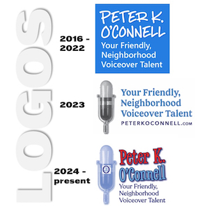
Turns out the third time was the charm for this edition of how the voiceover business card turns!

So, as I noted in an earlier post, I updated my voiceover branding to highlight my “Your Friendly, Neighborhood Voiceover Talent” positioning. Along with a logo redesign and website update, news business cards had to be created.

As a few of you may remember, I do like my business card design posts…so do many of my voiceover blog readers. Business cards are a great creative opportunity to not only share contact information but also to become memorable among your prospects.

That’s especially true for voice actors who need to show a dash more creativity in our branding because many of our prospects and clients work in design and advertising and they notice that stuff!

This story of my new business cards will focus less on the actual design (although that will play a part in the story). This voiceover business card story will tell a tale of the printing of the business cards. And the printing of the business cards. Then finally, the printing of the business cards.

Having sent the design of my new cards to my graphic designer, I had to pick a style of card (there’s lot of them…with different corners, paper stock and coatings…oh my!). To print them, I decided to go with the on-line printer Moo.com.

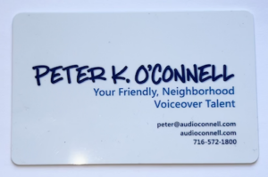
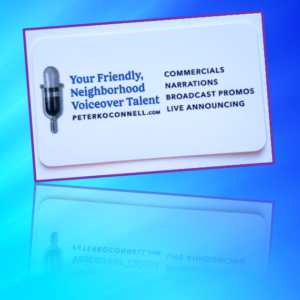
By way of a little background, I had really gone all out on my last business card design. I found a company that printed plastic business cards that were very well received by all who got one. Such nice comments.

But plastic business cards presented a couple of issues, I realized over time.

One is that plastic business cards are VERY expensive. Also, I carry some business cards in my wallet and there were times when I went to hand one out and the cards had rubbed to together, get super smudged and they looked awful. I wasn’t about to carry a separate business card holder with me everywhere so the scratched and smudged expensive business cards were a costly annoyance for me. Finally, business cards feel like they are become a less necessary tool as so many connections are made virtually vs. in person.

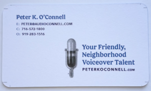
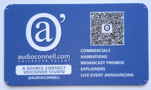
So no plastic cards this time. Moo has this really nice, super thick paper stock that I thought would work really well. It even has color on the edges of the card. I was sold. My graphic designer gave me the setup design to upload and we were off!

Well it turns out…we were way off. My designer submitted the business card art with crop marks that most printers use. Moo did not want or like the crop marks. So the printed business cards came out showing some of those hash marks.

To Moo’s credit, their quality control caught the mistake and notified me that the cards with the crop marks had shipped but Moo said they could fix the issue and would reprint free of charge.

Before the ‘fixed’ cards arrived, I received the crop marked cards. Turns out the crop marks printed on the finished business cards were not the only issue these cards had. On the back of the new cards, I used a blue background. I found that the blue ink smudged pretty easily when I put some of the crop marked cards into my wallet to see how they fit.

Oy, here we go again…the expensive plastic cards had color smudging and now the new heavy thick paper cards have the same problem.

A little later, the “fixed” cards from Moo arrived. While Moo’s “fix” had removed the crop marks it also threw the design way of balance because they basically tried to “zoom” in to get rid of the crop marks. It was a bad look. These cards weren’t going to work either.

Something good did come of these printing errors.

I decided that the back of my card design was actually way too busy. My fault. I had inadvertently thrown the kitchen sink at that part of the design; yes cards were functional with all the information contained but the design (its function) was too cluttered.

Maybe the printing error was my graphic designer Guardian angel’s way of saying “try again, kiddo!” Indeed I would.

I decided in the redesign to go for mostly white in color…front and back…to cut down on the opportunity for smudging. Also I cut down on the words and made the fonts a little bigger and easier to read. I decided to go away from the thick paper stock and go one step down to Moo’s less thick but coated card stock. Hopefully this would lead to no or less smudges and scratches. It’s a wallet causing the issue so it may never be perfect.

With the new design done and formatted the way Moo.com liked it, their customer service person confirmed the designs met their standards and the art was uploaded for printing.

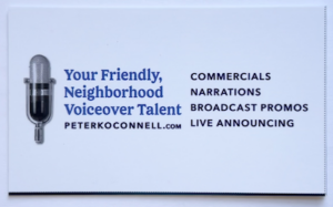
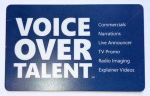
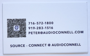
A few days later, I got THIRD version printed business cards. Inexplicably, these newest cards had printer cut lines on them and a black line at the bottom. None of these markings were on my submitted artwork.

Oh and about the rounded corners I had ordered…there were none…all 90 degree angles.

It was a production problem, I was told.

At this point, I had to speak with a Moo.com manager. It was too much and too sloppy.

I need to note that all the Moo.com customer service people I emailed with and spoke during this process with were all very nice and professional.

But I expressed my understandable frustration to the manager who not only credited me for the whole order, reprinted my cards, had them hand inspected and shipped over night (all at no charge) but also gave me a credit for future orders. Aside from paying off my mortgage, they was nothing else they could have done for me so I was satisfied.

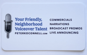
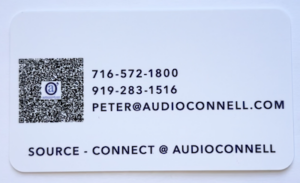
Today, I got my cards…as I wanted them. Simple, understated & functional yet attractive and a bit of “oh hey, these feel nice!”

Business cards are hardly the most critical part of a business’ marketing efforts…but they ARE a part of it. They need to look the way they are supposed to look.

Now they do.

Be patient with your vendors, be patient with yourself…on business cards or any aspect of running your business.

Enjoy the ride.

PBS updates their network logo

PBS logo Old vs New 2019There are a few brands that get a lot of attention when they change their logo.

The first one that comes to my mind is Pepsi. You may have other examples.

Some people think that when companies change a logo, it’s meaningless. We marketers call those people soulless. There’s nothing we can do to help them….or their pocket protectors. 😉

When the big TV networks’ logos change, it’s still a big deal. While the big 5 networks (ABC, CBS, Fox, NBC and PBS) themselves seem to be losing the cultural influence they once had, due to the preponderance of programming choices from streaming sources…broadcast TV networks still get a ton of viewers.

So PBS (the Public Broadcasting Service) changing its logo this week on the eve of its 50th anniversary is worth noting from a branding and marketing perspective. PBS’s programming remains unique in many areas because it offers so much content not found on commercial or cable services. It is also a vital brand to over 300 PBS affiliates around the country.

So let’s take a look at what PBS did.

PBS Logo 2019Right off the bat, the new PBS logo is blue. But not just ANY blue. That’s PBS Blue. Corporations, like PBS, love to stroke their corporate egos by creating a unique color and making up words about what that blue signifies.

You know what PBS Blue signifies? BLUE! Sheeesh! Next item.

For perspective purposes, I should let you know that the circles (aka “the shield”) on the old and new logos are pretty much the same size. That might give you some clues to the changes.

Within the circle (or shield) the heads in the new blue logo are bigger…not a bad move in the digital age. And while it may look like PBS didn’t really change the heads on the shield that much…they actually did.

The “neck” is shorter in the new logo, the noses are slightly less pointed and (in a part I find hysterical, given the brand) the noses are slightly raised.

Also bigger (quite obviously) is the PBS wordmark. I think bigger is better for this logo. It’s designed in a sans-serif font that was (here we go again) custom designed for PBS and is know as PBS Sans typeface.

If you’re thinking it looks very similar to about 3 or 4 fonts from your Microsoft Word font catalogue, you’ll get no argument from me. Those are your tax dollars at work, folks.

The final word? It’s a nice redesign and better than the old logo (although I thought the PBS logo of 1984 was pretty classic – see the video link below). I think if I was custom designing a font, I could have crafted something more visually interesting then what they ended up with…but they didn’t ask me now, did they? 🙂

WATCH THIS if you want to see a cool video on the history of the PBS logo.