Entries Tagged as ''

mca-i gets a logo makeover

 Media Communications Association-International has completely redone their association logo

Media Communications Association-International has completely redone their association logo

Before I begin, I feel I must disclose that I was a past-member of Media Communications Association -International (MCA-I) and a national board member.

That’s right, the poor group (at the time) must have been in such desperate shape that they put me on their national board. And I have friends who are still on that board (and who are making it a great association today). I like the group but I was the only Buffalo-member, and with kids, I couldn’t build up the group locally — no time. But we did some great stuff of the national group.

With all that cleared up, I feel I am ready now to address that MCA-I has gotten a brand new logo for the association.

For any of you who have ever served on a not-for-profit board, you know that getting marketing stuff done like a new logo is like passing a kidney stone…difficult and painful, there will be vomiting and crying and the positive result will be a relatively small outcome from a lot of work.

But in MCA-I’s case, the new logo was TOTALLY worth the effort. It’s awesome!

I don’t know who designed the logo but it’s great.

I suppose I actually ought to give some historical perspective on why this new logo came about.

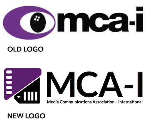
The old logo sucked.

OK, enough with beating around the bush, eh?

Well, I liked the colors of the old logo and the font but it was altogether too odd. It looked too much like one of the drawings CBS might have thrown out when they were first designing the CBS Eye logo. This is just my opinion of course, but since they have a new logo, someone in power over there agrees with me.

Allegedly.

This new logo (specifically with it’s icon) speaks to the heritage of the media professionals who started the association, working initally in film, evolving with the medium into video, straight through to the new generation of digital media producers who make up much of the MCA-I’s current memberships (certainly there are still many filmmakers still in the group).

For all of them, that icon totally works.

The font and capitalization of the word mark is sharp with rounded and pointed corners. Just nice. And they held on to those great, unique colors.

Plus I have seen some different versions of the logo for different uses and it is really flexible.

So congrats to ALL who were involved in the design of this new logo and the marketing plans that go with it. Job well done. I hope your group continues to shine.

the internet lies

Look closely at this story...the gentleman (and we use the term loosely) in the picture is NOT the head of Cheltenham Ladies' College. Honestly, we're not sure if he can spell college

Look closely at this story…the gentleman (and we use the term loosely) in the picture is NOT the head of Cheltenham Ladies’ College. Honestly, we’re not sure if he can spell college.

I suppose if you’ve been involved in an internet business long enough, have been posting long enough and have been referenced as a source enough, something like what you’re seeing here is bound to happen.

We’ve all seen weird stuff on the internet but let me tell you, having a news site plaster my face across a page and label ME the head of a UK women’s college was beyond weird.

I know what you’re thinking. But this is not something that was photoshopped or any thing like that. This was a page on the internet from a purported news site.

 Here's the close-up version featuring the 'head' of Cheltenham Ladies' College

Here’s the close-up version featuring the ‘head’ of Cheltenham Ladies’ College

The nice woman in the below photograph likely studied hard, rose up through the ranks and is a fine educational leader. The gentleman on the left “allegedly” never went to class before noon.

On the left is a voice-over talent. On the right is head of a college. How does a news organization confuse the two?

On the left is a voice-over talent. On the right is head of a college. How does a news organization confuse the two?

So how does this happen? There is no way any human confused me for the leader of this college, so it’s my guess that some news bot botched this.

But too many people take what they read on this internet as gospel so heed this warning – this article proves it is not!

the clippers aren’t the braves

The NBA's Buffalo Braves were kidnapped and taken to San Diego and then to Los Angeles to become the Clippers

The NBA’s Buffalo Braves were kidnapped and taken to San Diego and then to Los Angeles to become the Clippers

So the NBA’s Los Angeles Clippers had kinda of crazy season last year, having less to do with basketball than a loud-mouthed owner who said horrible stuff in front of his mistress that she publicized and which allowed his wife to sell the team out from under him.

And now they have a new logo. Oh and a new owner.

The logo sucks. Not for any graphic or design reasons.

Years ago in the late 70’s, the local owner of the NBA’s Buffalo Braves sold his interests in the team to a couple of other fellas who helped move the team to San Diego and then Los Angeles, where they became the Los Angeles Clippers.

Therefore, because I’m a Buffalo boy and because of my obvious personal bitterness to this BS transaction all those years ago, Picasso himself could have designed the Clippers new logo and I would STILL say it looked like crap.

Screw the Clippers.

what the hell?!

 Can you spot the wasted money in this picture

Can you spot the wasted money in this picture?

No, I’m not kidding. That IS Verizon’s NEW logo.

The first logo was kinda stupid. The new one is asinine!

The Z!!!! The Z was the only modestly interesting thing about the old logo and, and, and….it’s gone.

Somebody got PAID for this new piece of crap?! In real dollars?!

Oy!

Oh, maybe I should be clearer.

I do not like the new Verizon logo.

google this!

The before and after of the Google logo change revealed today

The before and after of the Google logo change revealed today

My swell friend and fellow voice-talent Elaine Singer pinged me on Facebook tonight regarding the recently revealed Google logo change, asking “So, Peter K. O’Connell, what am I supposed to think about the new Google logo?”

It occurred to me that I really have been lax in my logo reviews. Mostly because I was of the mind that I was one of the few people I know (who aren’t graphic designers and I aren’t 🙂 ) who notice these things and have strong opinions on them. I was beginning to feel like when I was writing about logos, I was coming across as more obnoxious than usual. So I trailed off – plus this is primarily a voice-over blog with a dash of marketing and advertising thrown in.

Clearly, though, some people have been awaiting my logoed opinions. So for this post, blame Elaine.

You might have missed this announcement today, subtle as it was, with Google making the first major Google logo change in, like, 15-16 years. It’s a pretty big change for one of the world’s biggest brands (which is why it’s news).

What’s the same: The colors and the font spacing are pretty much the same (the colors might be a shade softer). The new logo is also flat, no dimension, like previous most recent Google logo. This flat logo design has been a trend in much of the tech industry’s branding coming into the past 5 years (boy, there’s a real broad brush stroke of logo analysis – don’t ask me to back it up with evidence as I have no time).

 The old and the new logo layered on each other to highlight differences

The old and the new logo layered on each other to highlight differences

The biggest difference for me: font and attitude. Going from a serif font to a sans serif font is change enough but this logo has attitude, I think. My first thought was that it was childish. Then I changed my opinion to child-like and then I settled on fun.

Fun is the attitude that this new Google logo came to mean to me. Why.

A couple of things stood out to me that made me think “fun” was the objective (in my totally subjective opinion) of the new Google logo.

Start with the second “g”. In that font, that small “g” always looks like a smile to me. In fact, for years, Goodwill took that smile to the forefront of their logo.

Then I looked at the “e”. They kept it very similar in angle to the old “e”, which really looked like a laughing “e” except in the old logo (with it’s formal Garamond-like font) the rest of the work mark’s formality didn’t make the “e” seems as fun as this new font does.

BTW, my guess is this new font, like the old one, is specially designed with it’s own name and patent- meaning it’s like a million other fonts with a millimeter of a pixel difference just so Google can, with full hubris, call the font its own. Whatevs.

Then there is the big “G” (not to be confused with General Mills‘ big “G”). To me, it seems jolly, certainly softer and more easy going (as are all the letters in this word mark) than the old logo. Note also that these are pretty straight on “o”‘s too, not angled like O’s in the most recent Google logo. Together with the rest of the letters and the colors, this all combined to make me think Google is going for the child-like wonder we enjoy when we explore the web and discover something for the first time. Child-like fun and wonder.

Now, just so you know, I’m not the only idiot that writes this kind of drivel about logos. There are hundreds of blogs tonight writing about this same topic. Many/most/all of them have much better artistic and design analysis on this logo than I can offer. And they will probably offer the insights of the company and the designers who can tell you what it’s REALLY supposed to mean (and, thereby, just how far off I am in my opinions).

But screw all them. Brand perception is all individual anyway. 100 people shown the same logo will have 100 different reactions. The designer and the marketer’s hope can only be that the majority of opinions have something positive to say about a logo (which then reflects on the brand).

I like the new logo (not love). I don’t know why in this age of high-end resolution we can have logos that has some (even a little) reproduce-able depth to them, but that’s not the trend. If they were going for fun, child-like exploration of learning new things with Google and its products, then it works.

What do YOU think of the new Google logo? And while you answer, here’s what Google thinks