Can Cracker Barrel Be Saved After The Logo Debacle?
If America loves the Cracker Barrel logo so much (as the recent logo controversy would suggest) should Voice Actor Peter K. O’Connell change or “Cracker Barrel” his logo?
Let’s be honest, the announced logo and overall brand reimagining for Cracker Barrel restaurants announced recently could NOT have gone much worse.
This kerfuffle takes the logo debacle that the Gap Stores instigated when they TRIED to introduce a completely new logo in 2010 (which was an IMMEDIATE disaster) and raises it beyond retail and into the muck and mire of the political world. Whoa…that’s bad.
The new restaurant logo (when compared to one another – old v. new) makes it seem like the logo designer never stepped into a Cracker Barrel. It does not fit with the store image (personality) that most consumers have or seem to want for Cracker Barrel.
But the logo is just one part of a reported $700 million rebrand…and it sounds very much like the Cracker Barrels of tomorrow will not resemble much of what customers see today.
At present, it has been said that Cracker Barrel is executing “pilot remodel tests” in about 25-30 stores as a part of a multi-year strategic transformation plan (see $700 million). The changes planned for the Cracker Barrel chain include lighter paint options, new fixtures and lighting, and repositioning décor – all changes designed to enhance the guest experience by providing an environment that feels lighter, brighter, fresher, and cleaner.
Well, that WAS the plan.
Customers are upset, the general public is upset (even people who don’t regularly go to Cracker Barrel, it seems) and for reasons still unclear to me, some politicians have decided to be upset about this logo change – where do THEY find the time??
If you think about it, a chain only makes plans to fix all this stuff ($700 million worth of stuff) if either sales are down, research says customers specifically want change or some combination therein.
But the completely negative reaction to the Cracker Barrel logo change (and maybe also the interior changes, although that feedback is spotty this far) seems to effectively shoot in the foot whatever drastic (or even less drastic) plans the restaurant had for the interior.
What can Cracker Barrel do? Stop. Drop. And roll.
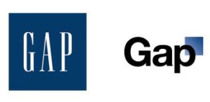
On the left – the old-new logo. On the right – the dead Gap logo
Reconvene the designers for both logo and interior and say, we may need to make these changes but we are going to have to redefine the timeline and degree to which we implement these changes. Then implement a plan to calm consumers.
Regarding the logo…I’d implement some version of the ”just kidding” plan to the public, squash talk of that new logo immediately and then test a middle ground logo between the original and the new. It would then be presented in a much softer roll out.
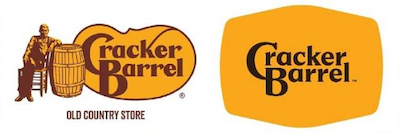
The current Cracker Barrel logo on the left with the proposed new logo on the right. Imagine the new font style on the right with the consumer approved icon on the left in a combined “new” logo…might have been an easier change for consumers to accept.
They could have done this initially, btw. How about we just change the font style to the new look and keep the icon. Then in phase two, revise the sign/logo to just the word mark and no icon? Too expensive you say? Cracker Barrel’s plan A for logo roll out cost the company $94 million in market value in 1 day (worst ever for the company). Makes the tiered sign change costs seem like a bargain in comparison, doesn’t it?
Next, time for some spin.
Turn the logo negative into a positive…”clearly the public has spoken and shared how much the Cracker Barrel brand and logo mean to them. We love it just as much and are only working to enhance the experience of our valued customers based on their feedback.”
In essence, we hear you and we are responding to what you want, even (Cracker Barrel might say under their breath) if you all said something very different in our consumer research).
“We love all the at home designers adding their spin to our design process online and see it a nice compliment.”
“We’re not perfect but Cracker Barrel means as much to us as it does to you. As we evolve to meet the needs and tastes of our deeply respected customers, know that we will never forget that it IS the customer that comes first at Cracker Barrel.”
No doubt someone on their marketing team can make those words sing much prettier than I have done here but presenting that kind of message to the direct and indirect Cracker Barrel consumers should help calm the storm.
I have other ideas but no one is paying me so they’ll have to figure the rest out on their own.


 A voiceover business like mine,
 Go ahead and TRY and tell me you’re not the least bit curious about a baseball team called the