
The $10.1 Billion Question for Voice Actors: How New Pharma Ad Changes Could Reshape the Voiceover World
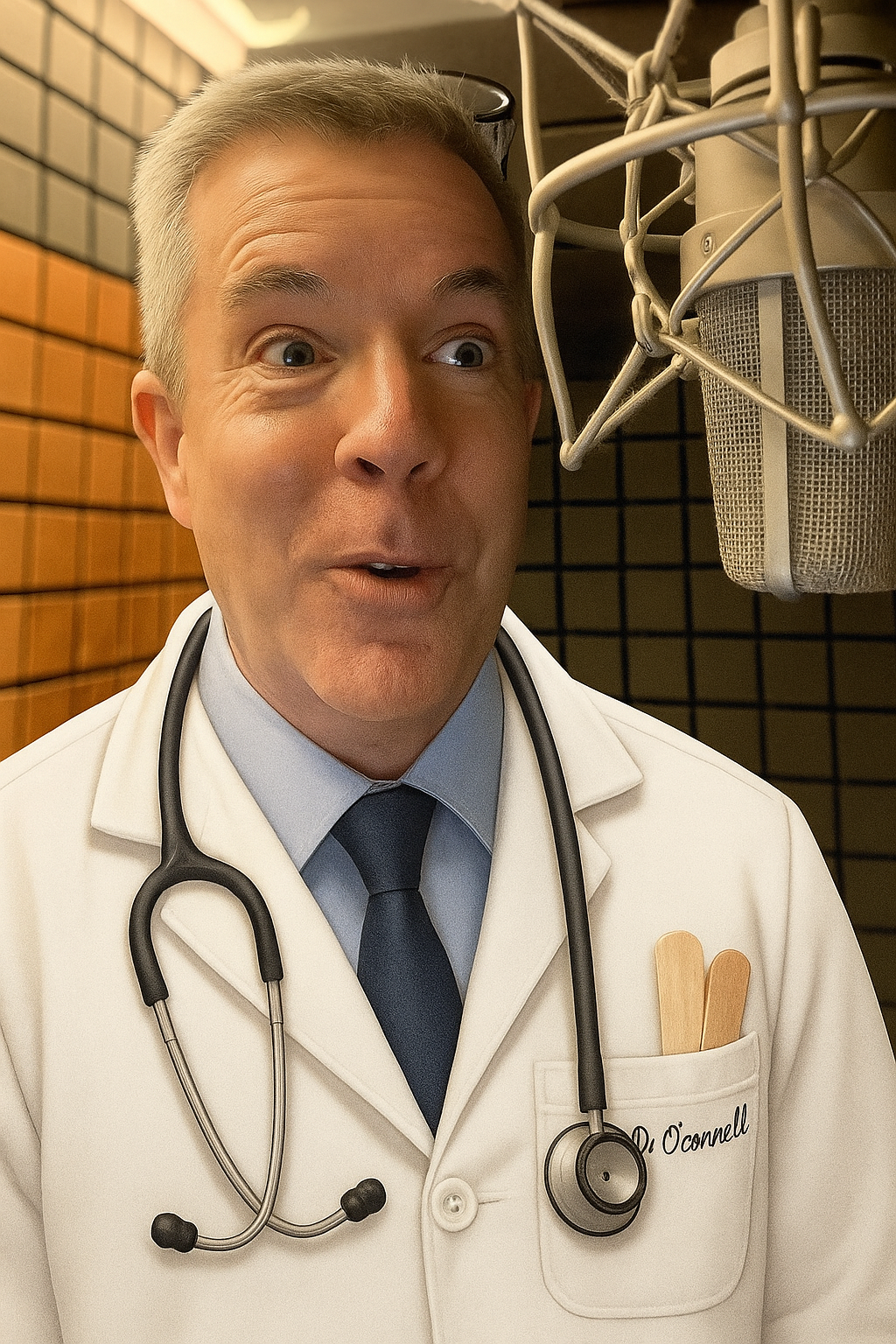
“I’m not a real doctor but I play one in commercials” – voice actor Peter K. O’Connell
Voice actors, buckle up.
On this Halloween, this is not a trick but it also may not be a treat either.
A seismic shift is coming to the $10+ billion pharmaceutical advertising industry—and honestly, even the big players in this marketing world aren’t entirely sure where it’s all heading.
I recently came across an excellent piece by Maia Anderson at Healthcare Brew that breaks down what’s happening with pharmaceutical advertising regulations, and it got me thinking about the ripple effects on our corner of the ad industry – voiceover.
If you’ve ever recorded one of those rapid-fire disclaimers about pharmaceutical side effects or told viewers to “ask your doctor,” you know that pharmaceutical DTC (direct-to-consumer) advertising represents a not insignificant chunk of commercial voiceover work. Many of these scripts may not be winning creative awards, but they’ve been reliably helping many of us pay mortgages, insurance premiums, and maybe even fund our home studio upgrades.
Now, the entire marketing landscape might be shifting beneath our feet.
What’s Happening?
(Quick note: This post is purely informational—not a political statement. Just sharing the facts of a news story that could affect our industry.)
A recent policy change by the Trump administration has pulled the plug on something called the “adequate provision” loophole from 1997.
Translation?
Pharmaceutical companies can no longer breeze through safety information in TV ads and direct people elsewhere for details. They’ll need to spell everything out—every side effect, every warning—right there in the commercial.
Read that….now think about the scripts we’ve been voicing…now think about “how in the world are they going to say all that in a TV spot?”
The FDA isn’t messing around either. They’ve already sent out thousands of warning letters and roughly 100 cease-and-desist orders to pharma companies about “deceptive” advertising.
The Numbers That Should Get Your Attention
Let’s talk advertising budget reality here, because this hits right at the heart of what affects us as voice actors:
- Pharmaceutical advertising spending hit $10.1 billion in 2024, with about half ($5.15 billion) spent on TV ads alone
- In just the first three months of 2025, drugmakers dropped an estimated $729.4 million on commercials for the top 10 pharma brands alone—nearly 30% more than the previous year
- Industry experts predict these new requirements will make broadcast pharmaceutical advertising “very expensive and very difficult”
- Ad agencies are warning that if advertisers need to buy 30 more seconds of airtime just for safety disclosures, “that’s going to cut down on your spend and cut down on your creative opportunity”
- The result? Most TV ads would likely come from only the biggest pharma companies who can afford the longer, costlier ad spots
What This Means for Voice Actors
Here’s where it gets interesting for us and the commercial producers and ad agencies we work with. Longer ads could mean fewer ads. Fewer ads could mean smaller production opportunities and less creative advertising spend. Smaller production opportunities mean… well, you can do that math.
Some pharmaceutical advertising insiders predict a major pivot to “unbranded” advertising—creative ads that talk about conditions rather than specific drugs. Others think marketing dollars will shift toward healthcare professional advertising or patient advocacy. Either way, the traditional :30 and :60 TV spots with our disclaimer voiceovers could become an endangered species. Or maybe not, because…
Nobody Really Knows (And That’s The Point)
What strikes me most about this story—and why it fits perfectly here at voxmarketising where we’ve been covering the intersection of voiceover, marketing, and advertising for decades—is that even the smartest people in pharmaceutical advertising are basically shrugging their shoulders, very unsure of what’s next. One agency managing director summed it up perfectly: “Like everything else with this administration, you just kind of play it day by day and see where things go.”
So what should we voice actors do?
Panic…that’s certainly the best option.
I’M KIDDING!!!!
Stay aware. Keep your VO skills diverse. Don’t put all your eggs in the pharma basket if you haven’t already. And maybe polish up those healthcare professional demo reads—that sector might be getting a budget influx.
The pharmaceutical advertising world is heading into uncharted territory, and we’re all along for the ride.
Stay informed, stay flexible, and keep those mics warm.
I hope this helps.

 One of the nice things about my voiceover and audio production business is that, because it is a web-based business, I can work nationally and internationally.
 You know I’m always late to trends – by years – but I’ve never considered having an unboxing or producing an unboxing video before.
