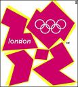
a logo flop of olympic proportions
Some things just strike me as funny.
That includes the minor misfortune of others and in this case, the “others’ happens to be the citizens of London, England.
London, you see, is home to the 2012 Olympic Summer Games, which I have no doubt will be a smashing success as Olympics go…great athletic achievements, dramatic stories of accomplishment, amazing new venues and some boon to the UK economy. All of it very impressive and deservedly so.
Except for the logo.
Every Olympics has a logo. Without it, you can’t sell Olympic t-shirts and mugs and hats and cups and lighters and bookmark and underpants and baby bibs and earrings…all of which add up to a sizable revenue chunk in any Olympic budget. So the logo has to evoke something positive about the Olympic experience, the flavor of the city the Games are being held in and ultimately be attractive. Or at least not unattractive. Or at least not suck.
Oh my but does the 2012 Olympic Summer Games logo suck…on a global scale.
The committee in London, led by Committee chairman and former British distance runner Sebastian Coe, paid the design firm of Wolff Olins over $800,000 to design the logo that all of London and eventually the world was to embrace and promote.
Except London didn’t embrace the logo. They hated it.
A BBC on-line vote with nearly 11,000 votes cast showed 85% hated the logo with 4% saying they really liked it. When introducing a new brand, these are NOT the numbers you hope for.
Need a few more facts?
This design, which comes in a variety of color schemes, when animated caused 10 people to complain about the animation of logo because some of them suffered seizures when they saw it on the official Olympic web site.
Are you going to buy a logoed product that may cause seizures?
Bless the government’s leaders as they stood by this awful design. Outgoing Prime Minster Tony Blair said “When people see the new brand, we want them to be inspired to make a positive change in their life.” Maybe it’s me but I don’t see having seizures from looking at a logo to be a positive change in my life.
The London Olympics branding web site has a gallery of “civilian” logo submissions and I think there are plenty in those galleries that would been a much better branding icon than the $800K klunker.
As an icon, there may be been uglier or dumber looking images, but from a branding stand point, London’s Olympics are not starting out well.
From a humor stand point, they are starting out great!
My advice for this logo or any others going forward can be summed up in two words: focus groups.
P.S. Here’s a link with some other more attractive logos (I especially liked the Paris logo…I think that would have been a huge hit, you know, had they…won the bid).


The phrase “great minds think alike” comes to mind:
http://sethgodin.typepad.com/seths_blog/2007/06/logos.html
[…] read more | digg story […]
[…] I have proclaimed my fervent interest in Olympic logos before and I shall again here. It’s international design, it’s so […]