Entries Tagged as ''

cheerleader or backstabber?

My voice over friend Stefania had a blog post that started my wheel house spinning. It was about relationships and how we should treat people.

It begged the question in my head: wouldn’t you really love to know what’s going on inside your client or prospect’s head sometimes?

Wouldn’t that be really helpful when negotiating your fee, for example?

Selfishly, I think we’d all (client and vendor) like that ability sometimes but just for a second, I’d like imagine we COULD know what a client is thinking – specifically about us as service providers. How would we feel about their honest, internal answers that in reality we’ll never know?

Do they think of us as competent or merely convenient?

Are we considered creative or average?

Honest or questionable?

When our transaction is done, will the client be our cheerleader or a backstabber?

The truth and the challenge is, since we cannot know, we can only focus on how we comport ourselves in both word and deed…and how we manage (as Stefania pointed out) relationships.

Or expectations.

Oooo, there’s the question! What do clients expect from us?

Well, great service, great job great value, duh!

But I think more than that, they want attention as part of their contract which I think also means/implies (maybe more importantly) respect.

We are probably polite to clients but are we respectful? Not subservient. Outwardly, buoyantly respectful of their time, talent and treasure.

I think we mostly are but I think we don’t truly think about being respectful, act on it, speak of it. We fall back to….politeness.

I guess I posted this mostly as a reminder to myself. A reminder of the code of conduct I wrote for this company in 2008. A reminder that when all is said and done, people would rather do business with friends and that friendship for me has always been built on mutual respect.

Am I talking crazy?

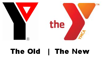
the new y

The Old and New Logos of the YMCA

OK, so the YMCA is in the news for updating their branding and that includes a new logo. I haven’t done a logo post in a while, mostly because I’m probably the only person that enjoys such conversation but in case you find this a fun diversion, here goes:

I have not yet read (as I write this post) the branding statement that the YMCA (or more likely its design agency) has put out describing the logo. Just by the way, I’m usually uneasy about these logo “explanations”; I understand the desire to offer some text clarification to an icon but usually these descriptions sound awful poofy.

So here is my initial opinions of the new mark…I hope YOU will chime in too with your own thoughts, just for the fun of it.

* Overall, I like it better than the old mark but I never really disliked the old YMCA logo

* I would not have gone with that color combination. With me and color, if I wouldn’t normally wear colors together, I think I’d rarely put them in a logo together (especially true of a 2 color logo)

* I wonder if the branding people are going to allow/encourage changes in color of the logo to visually represent the diversity of people who use the Y. That could be a nice creative touch – it could also lead to branding nightmares but that’s not my problem 🙂

* The main stem of the Y I think was designed like the play symbol on most audio and video devices (>) to mean play, go, move forward….all reasonable ideas to include for a YMCA logo

* I’m guessing the triangle part of the Y has some heritage meaning since it was a hold over from the old logo. I’d be interested to see if my guess is right

* I think the “the” in the logo is unnecessary. I know the new branding is about just calling the organization “The Y” instead of YMCA but as the organization has noted, people already call it “The Y” and have been doing it for years

* The YMCA at the bottom of the Y is fine

Of note, I have had my very first experience with the Y only this past weekend as my oldest started taking swimming lessons there.

OK, so now let’s look at the Y’s web site and pick out some logo tidbits from their release:

* “The Y’s former logo had been in place since 1967 and was the organization’s sixth since its inception.”

* “Today, across the United States, Ys are making a difference in three key areas of focus:

* Youth Development: Nurturing the potential of every child and teen
* Healthy Living: Improving the nation’s health and well-being
* Social Responsibility: Giving back and providing support to our neighbors”
Editors Note: While it does not reference it directly, I think these three points tie into the triangle part of the logo I mentioned earlier.

* “The refreshed logo, with its multiple color options and new, contemporary look, better reflects the vibrancy of the Y and the diversity of the communities it serves. The new logo’s bold, active and welcoming shape symbolizes the Y’s commitment to personal and social progress. ”
Editors Note: Well, as far as poofy goes, that wasn’t too bad. It mentions multiple color options so I may have locked on to something there (remember my diversity comment; I grabbed some of the variations off the web site). Talks about progress, hence the forward pointing Y stem. If you’re scoring at home, I did OK on this one

Color options for the new YMCA logo

What say you?

an overdue thank you note to keith carson of top hat productions

Keith Carson of Top Hat Productions presenting at VOICE 2010

I am ashamed of myself for the length of time it has taken me to properly thank Keith Carson of Top Hat Productions. Were my dear Mother alive she would rip me a new one for taking so long with a proper thank you. That was always a big deal to her and she was/is right.

Here’s the story:

Thursday at VOICE 2010, I pop into Keith Carson’s presentation “Your Voiceover Demo” which not surprisingly was packed. I was sitting on the floor against the wall in the back of the room listening and working on my laptop (busy day).

He’s talking about some good stuff when Keith holds up a CD (which I couldn’t see cause I was in the back on the floor) and says something to the effect of “what a great example of branding this CD has, this is Peter O’Connell’s.”

My head pops up like a gopher in heat cause I have no idea what CD he’s talking about as I hadn’t sent one out in about 5 years. And yet there was one of my CD’s in Keith’s hand as he continues to say how unified and perfect my branding is.

He held on to it…for years!

So with this gracious public compliment I repay him by waiting over a month to say thank you for the kind words. I’m not worthy but I am grateful and I do want to publicly say thank you to Keith for his compliment and his very generous presentation.

Thank you Keith!

Best always,
– Peter

mary mckitrick is taking drastic action

Mary McKitrick, female voice talent extraordinaire (or whatever the German translation of extraordinaire is) has gone and done it.

She done went and set up herself a Facebook fan page just like all the utter idjits out there.

Well, y’all better commence to fanning her right quick.

(Note to self: less sugar at dinner)

welcome john melley to the blogroll

In my YouTube searches recently, I came across some great videos on radio studios from John Melley because, well, he works in radio and his station just moved into new facilities.

It seems this is a blog you have to sign up for rather than get an RSS feed delivered directly to your reader but its good stuff so check it out.

UPDATE: John HAS now added an RSS button on his blog so you can get it delivered right to your reader. Thanks John.

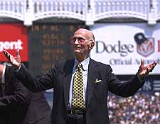
requiescat in pace bob sheppard

The Voice of God, Longtime New York Yankees public address announcer Bill Sheppard. Photo Courtesy USA Today - Bill Kostroun, AP

After 99 years on this earth and 50 years as the revered public address announcer for the New York Yankees, Bob Sheppard died July 11, 2010, about 3 months shy of 100 years old.

Wow, what a career her had!

“The Voice of God”, as he was affectionately known, now has a meeting scheduled with his namesake. I’m pretty sure they’re gonna talk baseball at some point.