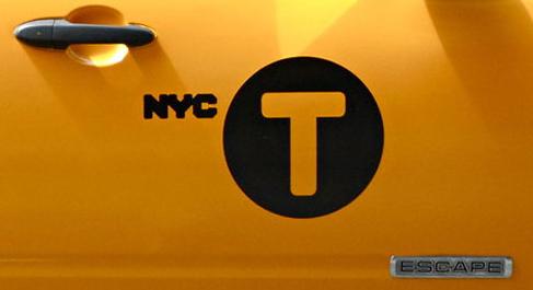
yo! taxi! uh, yo ‘T’!
Posted on September 2nd, 2012 by peter k. o'connell, your friendly, neighborhood voice-over talent
I don’t know if the New York City Taxi Authority envisioned a brand extension a few years back when they created the then new icon for all the cabs in NYC.
At the time, I was not such a fan of the look.
But now the Authority is updating the look to include the circle “T” as its primary icon and I think it looks really sharp.
Will this be off-putting to those public transportation riders in Boston? Their “T” has been around a lot longer with the name.
Who cares?! 😉


