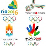
2016 olympic logos

Yes, I have proclaimed my fervent interest in Olympic logos before and I shall again here. It’s international design, it’s so incredibly personal for the competing cities and some of the designs are way cool (some in comparison are not way cool). It’s a fun and artistic exercise for me. You may just want to wait for the TV show, that’s your call 🙂
First a brief story about how this post came about and some design blogs that you may want to subscribe to because I know I enjoy their stuff. Brand New is a logo design site that I have spoken of before and it always seems to show me new stuff before it hits mainstream. This proves I am not the only logo nut out there just probably the only one who can’t draw a straight line.
Well today, Brand New was talking about the rebranding of the kids cable channel Nickelodeon. It will include a new logo and I’ll try and address that debate in a future post as there seems to be no official word from the network (though many hints) on the final logo version. The point is that Brand New referenced another logo design site called idsgn, who was also blogging about the Nickelodeon change – but they also blogged about the 2016 Olympic Candidate Cities and their logos.
Their question for you to answer in their comments is: “If the decision (to pick the 2016 Olympic host city) were based solely on design, which candidate would win?”
The four cities are: Chicago, Madrid, Rio and Tokyo. Please go to idsgn.com and leave your vote in the comments
Now if you don’t want to be swayed by my opinion stop reading here because I am going to tell you my choices in order now.
Again, last chance, stop reading if you don’t want to know my votes.
OK, they’re gone so now we can chat.
If I went with my heart rather than my design eyes I would have to pick Chicago. I have walked through O’Hare and seen their huge banner promoting their cause as host city and just thought it would be awesome if they won.
But because I have to pick with my design goggles on: it’s Madrid. Then I would rank them: Tokyo, Chicago and then Rio. When you go to the idsgn site and read the stories behind the logos, I think the spirit of the Madrid logo as well as its design match perfectly with what I feel is the Olympic spirit.
P.S. Here is a great follow up post on Olympic logos and how they’ve changed from bid to final logos over the past few Olympics


It was customized, yes.
Best always,
– Peter