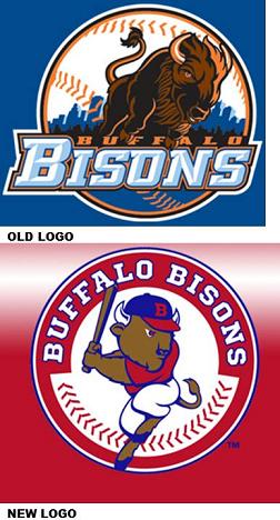
a logo downgrade for buffalo
Besides being Buffalo, New York’s only baseball team, the Buffalo Bisons are a pretty well respected franchise among triple A baseball affiliates. The club is run by a strong ownership and management team.
Which is why I was so incredibly surprised by their recent logo catastrophe.
In 2008, the Bisons ended their long MLB affiliation with the Cleveland Indians and signed with the New York Mets. Mrs. audio’connell grew up a Mets fan so that change pleased this household to no end. I like the Bisons no matter what so I don’t particularly care who they are affiliated with.
However when I saw the new logo the Met’s change brought with it, I was thrilled! A major league looking logo! The team had looked Triple A for so long in its branding, I was pleased to see the upgrade and immediately went out and bought lots of merch!
Well unfortunately for a multitude of reasons, the affiliation with the Mets didn’t work out and the Bisons organization executed a change to affiliate with the Toronto Blue Jays. While not a baseball expert, I think this move will really work out well for the Bisons.
The bad news is the team must have had a covert logo design contest among area 7th Grade design students to help Buffalo create the Bisons new logo under the new affiliation agreement with the Toronto Blue Jays.
Yes, you are seeing correctly, the red, white and blue logo is the NEW logo…not an old resurrected from 1947 logo. That’s the new one.
Shockingly horrible, isn’t it. To call it fugly is to be complimentary.
Are you saying to yourself, why didn’t they just take the Mets logo and change it to the Blue Jays color scheme? I know I asked that question too but then I guessed there might be a legal thing with the Mets on the old logo and oh well.
I look at this logo in the same way I look at our city, regional and state governments here and I ask the same question: is this the best we could do?


My heart sank. How embarrassing. You are so right in your commentary Mr. O’Connell, a very sad day for Buffalo fans. No new Bisons shirts/hats in this house until they fix that logo.
You’re not kidding, brother. What a step down in branding. That old logo was timeless, effective, evocative. The new one is a nightmare! But what a terrific coup for 99designs.com! 😉
It’s interesting Amy, having had some time pass to think about it…I think what might have happened was the team looked at their most recent branding along with their most recent record (a losing one as the Mets AAA farm team) and said let’s go back to something a bit more like our original look (which was also bad). But it has a pleasant memory for many local folks in a town where classic rock rules and everybody seems to pine for the 70’s (the city was more successful then). I’m not sure I’m right but I can’t think of another reason to take 10 logo steps back with this design. Oh well!
Best always,
–Peter
Thank you Mrs. O’Connell.
Best always,
– Mr. O’Connell