can i ask your opinion please?

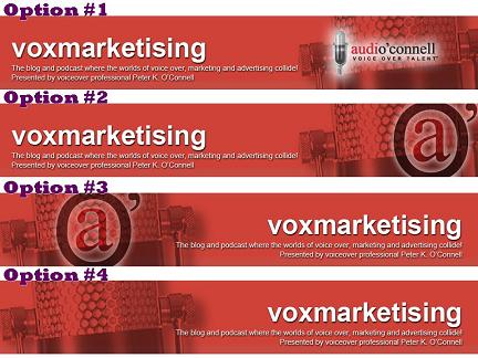
We’ll be doing some very minor redecorating of this blog (we’re going to widen it a little bit) but this will require that we change the size of the title banner.
So it occurred to me that maybe I should take this time to freshen the look for the title banner which was designed by me though I’ve never really been happy with all of it (some of it I like).

So I asked Ann Hackett of aHa Designs to craft some alternate versions of a new banner. This is where YOU come in.
Please, in the comment section, pick your favorite choice (numbered 1-4).
If you prefer, you may vote that you do not like ANY of them or that you like the current banner just fine.
I really value your opinion and no feelings will be hurt in the honest assessment of these designs!
If you’re willing, please also RETWEET this poll (see the little green button on the top right of this post above the options picture?) so that I can get as many opinions as possible.
Thank you.


Peter,
They’re all great, but I like 2 best.
Good luck,
Miss Jamee
I like #1
…because it has YOUR name as well as the voxmarketising….and it seems the most balanced.
Peace!
L.
Peter,
#3 is my favorite.
Be well,
Bob
#1 – best branding for the company name.
Design-wise, I prefer #2, but I agree w/ Robin that #1 spotlights your company name more effectively.
#1 is my favorite but would I suggest replacing the microphone with your
logo…
Gosh, Peter– this was kind of tough. They’re all strong choices. But I think #3 has the most visual impact, and I think that having the title over on the right is easier to read somehow. It just really works for me! I might make the mic a little more transparent, so that it’s almost just a bit of texture behind the logo.
Luv ya!
#1 is my vote, my friend!!!
I also like number #1 the best, also mainly for the reason that it includes your name. That should be there!
Hi Peter,
Here’s my choice: Widen the one you already have.
You have two separate entities you are promoting: You the VO and Voxmarketising “The blog and podcast where the worlds of voice over, marketing and advertising collide.
Why would you want to confuse and combine?
Dan
Peter, I would like to see Option #1 w/out the larger mic in the background…it would allow us to see your logo stand out a bit more. OR, Option #2 with the mic in the background removed and the @ a bit smaller so the top and bottom don’t get cropped.
That’s .02 of my .05 alloted.
:o)
Peter,
I like #1 and #2 the best.
I like 1 and 2, but 2 gives the impression that the section is all about contact, so while they both look good I’d go with number 1.
I like #1 because it seems more informative.
Best,
Bill
I’d like to see something with both your name and the a inside the O’. I recognize the aO’ logo from Twitter, but I’d still like to see your whole name.
Another vote for #1, again because it includes your name.
I like #1. If you have a specific logo add that in. You could play with the microphone and word positioning. I think although similar to your current banner it gives a professional and slightly conservative look to the site.
#2 hands down… I’ve always loved your “circled-a” branding logo…and I like it positioned on the right, with the words on the left.
Uh…do I get free movie tickets or something for participating?
CourVO
Add the right side segment of #1 to the center of #2, and you will have all the important elements in one package.
[…] you’ll recall my post a few days ago wherein I posted a poll requesting your opinion about the new design for the blog […]