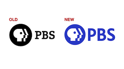
PBS updates their network logo
 There are a few brands that get a lot of attention when they change their logo.
The first one that comes to my mind is Pepsi. You may have other examples.
Some people think that when companies change a logo, it’s meaningless. We marketers call those people soulless. There’s nothing we can do to help them….or their pocket protectors. 😉
When the big TV networks’ logos change, it’s still a big deal. While the big 5 networks (ABC, CBS, Fox, NBC and PBS) themselves seem to be losing the cultural influence they once had, due to the preponderance of programming choices from streaming sources…broadcast TV networks still get a ton of viewers.
 So PBS (the Public Broadcasting Service) changing its logo this week on the eve of its 50th anniversary is worth noting from a branding and marketing perspective. PBS’s programming remains unique in many areas because it offers so much content not found on commercial or cable services. It is also a vital brand to over 300 PBS affiliates around the country.
So let’s take a look at what PBS did.
 Right off the bat, the new PBS logo is blue. But not just ANY blue. That’s PBS Blue. Corporations, like PBS, love to stroke their corporate egos by creating a unique color and making up words about what that blue signifies.
You know what PBS Blue signifies? BLUE! Sheeesh! Next item.
For perspective purposes, I should let you know that the circles (aka “the shield”) on the old and new logos are pretty much the same size. That might give you some clues to the changes.
Within the circle (or shield) the heads in the new blue logo are bigger…not a bad move in the digital age. And while it may look like PBS didn’t really change the heads on the shield that much…they actually did.
The “neck” is shorter in the new logo, the noses are slightly less pointed and (in a part I find hysterical, given the brand) the noses are slightly raised.
Also bigger (quite obviously) is the PBS wordmark. I think bigger is better for this logo. It’s designed in a sans-serif font that was (here we go again) custom designed for PBS and is know as PBS Sans typeface.
If you’re thinking it looks very similar to about 3 or 4 fonts from your Microsoft Word font catalogue, you’ll get no argument from me. Those are your tax dollars at work, folks.
The final word? It’s a nice redesign and better than the old logo (although I thought the PBS logo of 1984 was pretty classic – see the video link below). I think if I was custom designing a font, I could have crafted something more visually interesting then what they ended up with…but they didn’t ask me now, did they? 🙂
WATCH THIS if you want to see a cool video on the history of the PBS logo.


