
voiceover business cards: a moo-ving story of getting it right, eventually
 Turns out the third time was the charm for this edition of how the voiceover business card turns!
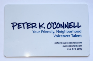
So, as I noted in an earlier post, I updated my voiceover branding to highlight my “Your Friendly, Neighborhood Voiceover Talent” positioning. Along with a logo redesign and website update, news business cards had to be created.
As a few of you may remember, I do like my business card design posts…so do many of my voiceover blog readers. Business cards are a great creative opportunity to not only share contact information but also to become memorable among your prospects.
That’s especially true for voice actors who need to show a dash more creativity in our branding because many of our prospects and clients work in design and advertising and they notice that stuff!
This story of my new business cards will focus less on the actual design (although that will play a part in the story). This voiceover business card story will tell a tale of the printing of the business cards. And the printing of the business cards. Then finally, the printing of the business cards.
Having sent the design of my new cards to my graphic designer, I had to pick a style of card (there’s lot of them…with different corners, paper stock and coatings…oh my!). To print them, I decided to go with the on-line printer Moo.com.
 By way of a little background, I had really gone all out on my last business card design. I found a company that printed plastic business cards that were very well received by all who got one. Such nice comments.
But plastic business cards presented a couple of issues, I realized over time.
One is that plastic business cards are VERY expensive. Also, I carry some business cards in my wallet and there were times when I went to hand one out and the cards had rubbed to together, get super smudged and they looked awful. I wasn’t about to carry a separate business card holder with me everywhere so the scratched and smudged expensive business cards were a costly annoyance for me. Finally, business cards feel like they are become a less necessary tool as so many connections are made virtually vs. in person.
 So no plastic cards this time. Moo has this really nice, super thick paper stock that I thought would work really well. It even has color on the edges of the card. I was sold. My graphic designer gave me the setup design to upload and we were off!
Well it turns out…we were way off. My designer submitted the business card art with crop marks that most printers use. Moo did not want or like the crop marks. So the printed business cards came out showing some of those hash marks.
To Moo’s credit, their quality control caught the mistake and notified me that the cards with the crop marks had shipped but Moo said they could fix the issue and would reprint free of charge.
Before the ‘fixed’ cards arrived, I received the crop marked cards. Turns out the crop marks printed on the finished business cards were not the only issue these cards had. On the back of the new cards, I used a blue background. I found that the blue ink smudged pretty easily when I put some of the crop marked cards into my wallet to see how they fit.
Oy, here we go again…the expensive plastic cards had color smudging and now the new heavy thick paper cards have the same problem.
A little later, the “fixed” cards from Moo arrived. While Moo’s “fix” had removed the crop marks it also threw the design way of balance because they basically tried to “zoom” in to get rid of the crop marks. It was a bad look. These cards weren’t going to work either.
Something good did come of these printing errors.
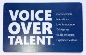
I decided that the back of my card design was actually way too busy. My fault. I had inadvertently thrown the kitchen sink at that part of the design; yes cards were functional with all the information contained but the design (its function) was too cluttered.
Maybe the printing error was my graphic designer Guardian angel’s way of saying “try again, kiddo!” Indeed I would.
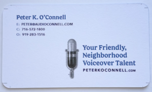
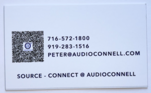
I decided in the redesign to go for mostly white in color…front and back…to cut down on the opportunity for smudging. Also I cut down on the words and made the fonts a little bigger and easier to read. I decided to go away from the thick paper stock and go one step down to Moo’s less thick but coated card stock. Hopefully this would lead to no or less smudges and scratches. It’s a wallet causing the issue so it may never be perfect.
With the new design done and formatted the way Moo.com liked it, their customer service person confirmed the designs met their standards and the art was uploaded for printing.
 A few days later, I got THIRD version printed business cards. Inexplicably, these newest cards had printer cut lines on them and a black line at the bottom. None of these markings were on my submitted artwork.
Oh and about the rounded corners I had ordered…there were none…all 90 degree angles.
It was a production problem, I was told.
At this point, I had to speak with a Moo.com manager. It was too much and too sloppy.
I need to note that all the Moo.com customer service people I emailed with and spoke during this process with were all very nice and professional.
But I expressed my understandable frustration to the manager who not only credited me for the whole order, reprinted my cards, had them hand inspected and shipped over night (all at no charge) but also gave me a credit for future orders. Aside from paying off my mortgage, they was nothing else they could have done for me so I was satisfied.
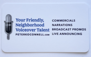
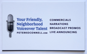
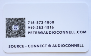 Today, I got my cards…as I wanted them. Simple, understated & functional yet attractive and a bit of “oh hey, these feel nice!”
Business cards are hardly the most critical part of a business’ marketing efforts…but they ARE a part of it. They need to look the way they are supposed to look.
Now they do.
Be patient with your vendors, be patient with yourself…on business cards or any aspect of running your business.
Enjoy the ride.
