
doodling leads to inspiration for new logo
It is possible that in another life I wanted to be a graphic artist.
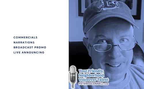
While voiceover is what I love (and I have some abilities), I enjoying playing around with graphic design and fonts (certainly my efforts would not qualify as ‘having abilities’).
The 2016 logo for “Peter K. O’Connell Your Friendly, Neighborhood Voiceover Talent” featured a more prominent position for the voice talent’s name and added the blue colors more commonly associated with his new home state of North Carolina
While I have designed all the logos I have used for my companies, I require the skills of a much more talented graphic designer to bring them to life. Thank God for her and her patience with me.
So why did I create the new logo in March of 2023?
When I moved down to Raleigh from Buffalo in 2016, I knew I wanted to update my voiceover logo and colors to reflect my new area (hence the move to blues and away from the original red and black). Plus, I never felt I really made my longtime tag line “Your Friendly, Neighborhood Voiceover Talent” LOOK friendly enough.
Also at the time, I correctly believed I needed to focus a bit more on the “Peter K. O’Connell” part of my brand as people sometimes didn’t understand that it was ME doing the voice work.
“So I get it’s your company (audio’connell) but who does the actual voiceover work?” Um. Uh. Me. I…do the, uh, voiceover work. For many decades now.
Awkward.
Yes, my name is the name of the product I’m selling (me) but I have always been self-conscious about it. It’s a conundrum – not wanting to promote yourself yet you are the brand..so you kinda have to promote yourself. It’s complicated.
The challenge about that prominent name placement in my logo was/is that it didn’t and never has felt natural and comfortable to me. I have always been self-conscious about the necessary evil of self-promotion in my voiceover business but in recent months, the name part just became personally annoying.
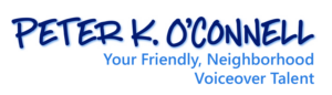
A version of the “Peter K. O’Connell Your Friendly, Neighborhood Voiceover Talent” logo modified for the male voice actor’s 40th year in voiceover
From a business marketing perspective, this may be one of the stupidest reasons to change a logo…what if the rest of the world likes the logo just fine? Why ruin a good thing? What if they hate the new logo. Stop changing things!!!
And then the self-loathing question…does anyone else really care or notice the “Peter” logo? Or ANY of your logos? (Geez, here we go….).
Anyway, that’s where my head was at for a long while.
So one night, not thinking I would be changing a logo and not actually focused on that thought, I was playing around with some fonts….and I hit on one that I thought really looked sharp when it spelled out “Your Friendly, Neighborhood Voiceover Talent”. It gave me a nice endorphin rush as I arranged the letters and words.
Ooooo, that’s a good sign. A design that was more about the “Friendly” and less about “Peter”.
But the design needed something else…and I remembered my great RCA-77 microphone that was part of a popular audio’connell logo from years gone by. When I added that mic to the words, the logo clicked for me. I slapped my name domain (peterkoconnell.com) at the bottom, readable but not prominent and I immediately felt more at ease.
Conscience relieved. Branding served. Win, win.
Then I showed the draft of the logo to a person whose opinion I respect…they liked the logo but didn’t think the font I liked was particularly “friendly”.
I tried to brush that comment off…of course the font was friendly.
Of course…it….was.
And I was about to get ready to finish the logo with the maybe-not-as-friendly-as-I-thought font when I got an email.
I believe in signs and this email had to be a sign.
It was a email announcing some new fonts from a type foundry and the email had in it a very friendly looking font.
I thought “she’ll kill me for making ANOTHER change” yet I sent the new friendlier font over to my designer anyway and she set it up.
Ooops.
Somehow the friendliness of the new font didn’t translate into the logo. The font looked kinda short and fat and frumpy.
I was a bit sad about it. Wasting time, wasting money. Oy!
Then I asked the designer, in a last ditch effort on my part, to squish inwards the left and right sides of the word mark together to see how it looked that way, a bit taller, hopefully?
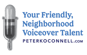
The 2023 version of the Peter K. O’Connell Your Friendly, Neighborhood Voiceover Talent Logo
Bingo. The word mark looked taller, sharper & friendly. That’s what you see now. Many endorphins. A fireworks of endorphins. It was done.
As much as I like the new logo now, I cannot guarantee that in another 7 years, I won’t change it again.
Because it is possible that in another life I wanted to be a graphic artist.

Love it!