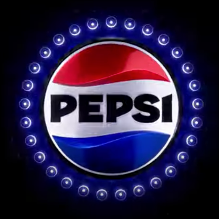
pepsi has a new logo and its meh

While Pepsi-Cola unveiling a new logo this week, I feel I must address this news for a multitude of reasons including:
- Although it is not healthy, Pepsi has always been my favorite soda
- Now that I live in North Carolina, where Pepsi was created, it’s kind of a civic requirement to address this logo redesign
- There hasn’t been this kind of big logo news in a while
- It’s also a slow news day
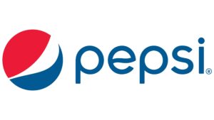
 So when Pepsi’s current logo was unveiled about 10+ years ago, it was a pretty big change to the font and the emblem from previous logo incarnations. Then it was revealed that the design agency of that logo crafted this huge brief about what all the geometry of the emblem meant and the reasoning for it and it was…a level of design hogwash that only accounts receivable managers at Ad Agencies could love – billable by the hour!!! Ridiculous!!
This new design moves pretty far away from today’s current icon. This new design has some fresh design elements of its own but also relies on beloved elements of historically more recognizable Pepsi logos.
The new 2023 design brings back the emblem design familiar in two old logos used from 1950-1997 while also bringing back the black font color used in the logo circa 1950-1986.
The biggest change is the font style of the word itself, Pepsi. The new word mark, which currently resides within the red, white and blue Pepsi emblem (as it had in some past Pepsi logos), is a bold, all caps customized font in black. It’s probably my least favorite part of this new logo.
It’s not the weird cut of the “I” in Pepsi that I dislike so much as the font design of the two “P”’s in Pepsi. They barely look like P’s as much as improperly drawn D’s whose rounded front couldn’t quite make it all the way down to bottom of a D’s vertical base. Taken together, the letters of the word mark look disjointed, mismatched and not great.
Over all, I’d give this logo redesign a grade of C, as in the first letter of Coca-Cola…who has an iconic scripted logo that will always be more iconic that anything Pepsi could ever create.
Pepsi still tastes better than Coke.


I dislike everything about it.The font and design are too”tricked out”I’m so sorry you’re changing it and can’t believe I’m actually commenting on this, Stick with a lovely classic designSo sorry.