google this!
My swell friend and fellow voice-talent Elaine Singer pinged me on Facebook tonight regarding the recently revealed Google logo change, asking “So, Peter K. O’Connell, what am I supposed to think about the new Google logo?”
It occurred to me that I really have been lax in my logo reviews. Mostly because I was of the mind that I was one of the few people I know (who aren’t graphic designers and I aren’t 🙂 ) who notice these things and have strong opinions on them. I was beginning to feel like when I was writing about logos, I was coming across as more obnoxious than usual. So I trailed off – plus this is primarily a voice-over blog with a dash of marketing and advertising thrown in.
Clearly, though, some people have been awaiting my logoed opinions. So for this post, blame Elaine.
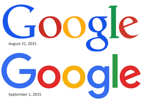
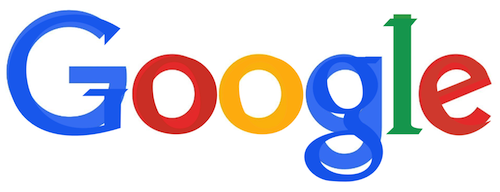
You might have missed this announcement today, subtle as it was, with Google making the first major Google logo change in, like, 15-16 years. It’s a pretty big change for one of the world’s biggest brands (which is why it’s news).
What’s the same: The colors and the font spacing are pretty much the same (the colors might be a shade softer). The new logo is also flat, no dimension, like previous most recent Google logo. This flat logo design has been a trend in much of the tech industry’s branding coming into the past 5 years (boy, there’s a real broad brush stroke of logo analysis – don’t ask me to back it up with evidence as I have no time).
The biggest difference for me: font and attitude. Going from a serif font to a sans serif font is change enough but this logo has attitude, I think. My first thought was that it was childish. Then I changed my opinion to child-like and then I settled on fun.
Fun is the attitude that this new Google logo came to mean to me. Why.
A couple of things stood out to me that made me think “fun” was the objective (in my totally subjective opinion) of the new Google logo.
Start with the second “g”. In that font, that small “g” always looks like a smile to me. In fact, for years, Goodwill took that smile to the forefront of their logo.
Then I looked at the “e”. They kept it very similar in angle to the old “e”, which really looked like a laughing “e” except in the old logo (with it’s formal Garamond-like font) the rest of the work mark’s formality didn’t make the “e” seems as fun as this new font does.
BTW, my guess is this new font, like the old one, is specially designed with it’s own name and patent- meaning it’s like a million other fonts with a millimeter of a pixel difference just so Google can, with full hubris, call the font its own. Whatevs.
Then there is the big “G” (not to be confused with General Mills‘ big “G”). To me, it seems jolly, certainly softer and more easy going (as are all the letters in this word mark) than the old logo. Note also that these are pretty straight on “o”‘s too, not angled like O’s in the most recent Google logo. Together with the rest of the letters and the colors, this all combined to make me think Google is going for the child-like wonder we enjoy when we explore the web and discover something for the first time. Child-like fun and wonder.
Now, just so you know, I’m not the only idiot that writes this kind of drivel about logos. There are hundreds of blogs tonight writing about this same topic. Many/most/all of them have much better artistic and design analysis on this logo than I can offer. And they will probably offer the insights of the company and the designers who can tell you what it’s REALLY supposed to mean (and, thereby, just how far off I am in my opinions).
But screw all them. Brand perception is all individual anyway. 100 people shown the same logo will have 100 different reactions. The designer and the marketer’s hope can only be that the majority of opinions have something positive to say about a logo (which then reflects on the brand).
I like the new logo (not love). I don’t know why in this age of high-end resolution we can have logos that has some (even a little) reproduce-able depth to them, but that’s not the trend. If they were going for fun, child-like exploration of learning new things with Google and its products, then it works.
What do YOU think of the new Google logo? And while you answer, here’s what Google thinks…


And if you’re REALLY into logos, this has a ton of info on the logo change.
http://www.underconsideration.com/brandnew/archives/new_logo_for_google_done_in_house.php#.Ved99LxViko