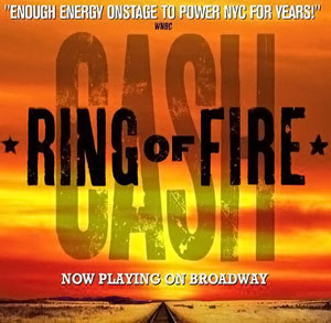
Entries Tagged as 'marketing'

voiceover business cards: a moo-ving story of getting it right, eventually

Turns out the third time was the charm for this edition of how the voiceover business card turns!

So, as I noted in an earlier post, I updated my voiceover branding to highlight my “Your Friendly, Neighborhood Voiceover Talent” positioning. Along with a logo redesign and website update, news business cards had to be created.

As a few of you may remember, I do like my business card design posts…so do many of my voiceover blog readers. Business cards are a great creative opportunity to not only share contact information but also to become memorable among your prospects.

That’s especially true for voice actors who need to show a dash more creativity in our branding because many of our prospects and clients work in design and advertising and they notice that stuff!

This story of my new business cards will focus less on the actual design (although that will play a part in the story). This voiceover business card story will tell a tale of the printing of the business cards. And the printing of the business cards. Then finally, the printing of the business cards.

Having sent the design of my new cards to my graphic designer, I had to pick a style of card (there’s lot of them…with different corners, paper stock and coatings…oh my!). To print them, I decided to go with the on-line printer Moo.com.

By way of a little background, I had really gone all out on my last business card design. I found a company that printed plastic business cards that were very well received by all who got one. Such nice comments.

But plastic business cards presented a couple of issues, I realized over time.

One is that plastic business cards are VERY expensive. Also, I carry some business cards in my wallet and there were times when I went to hand one out and the cards had rubbed to together, get super smudged and they looked awful. I wasn’t about to carry a separate business card holder with me everywhere so the scratched and smudged expensive business cards were a costly annoyance for me. Finally, business cards feel like they are become a less necessary tool as so many connections are made virtually vs. in person.

So no plastic cards this time. Moo has this really nice, super thick paper stock that I thought would work really well. It even has color on the edges of the card. I was sold. My graphic designer gave me the setup design to upload and we were off!

Well it turns out…we were way off. My designer submitted the business card art with crop marks that most printers use. Moo did not want or like the crop marks. So the printed business cards came out showing some of those hash marks.

To Moo’s credit, their quality control caught the mistake and notified me that the cards with the crop marks had shipped but Moo said they could fix the issue and would reprint free of charge.

Before the ‘fixed’ cards arrived, I received the crop marked cards. Turns out the crop marks printed on the finished business cards were not the only issue these cards had. On the back of the new cards, I used a blue background. I found that the blue ink smudged pretty easily when I put some of the crop marked cards into my wallet to see how they fit.

Oy, here we go again…the expensive plastic cards had color smudging and now the new heavy thick paper cards have the same problem.

A little later, the “fixed” cards from Moo arrived. While Moo’s “fix” had removed the crop marks it also threw the design way of balance because they basically tried to “zoom” in to get rid of the crop marks. It was a bad look. These cards weren’t going to work either.

Something good did come of these printing errors.

I decided that the back of my card design was actually way too busy. My fault. I had inadvertently thrown the kitchen sink at that part of the design; yes cards were functional with all the information contained but the design (its function) was too cluttered.

Maybe the printing error was my graphic designer Guardian angel’s way of saying “try again, kiddo!” Indeed I would.

I decided in the redesign to go for mostly white in color…front and back…to cut down on the opportunity for smudging. Also I cut down on the words and made the fonts a little bigger and easier to read. I decided to go away from the thick paper stock and go one step down to Moo’s less thick but coated card stock. Hopefully this would lead to no or less smudges and scratches. It’s a wallet causing the issue so it may never be perfect.

With the new design done and formatted the way Moo.com liked it, their customer service person confirmed the designs met their standards and the art was uploaded for printing.

A few days later, I got THIRD version printed business cards. Inexplicably, these newest cards had printer cut lines on them and a black line at the bottom. None of these markings were on my submitted artwork.

Oh and about the rounded corners I had ordered…there were none…all 90 degree angles.

It was a production problem, I was told.

At this point, I had to speak with a Moo.com manager. It was too much and too sloppy.

I need to note that all the Moo.com customer service people I emailed with and spoke during this process with were all very nice and professional.

But I expressed my understandable frustration to the manager who not only credited me for the whole order, reprinted my cards, had them hand inspected and shipped over night (all at no charge) but also gave me a credit for future orders. Aside from paying off my mortgage, they was nothing else they could have done for me so I was satisfied.

Today, I got my cards…as I wanted them. Simple, understated & functional yet attractive and a bit of “oh hey, these feel nice!”

Business cards are hardly the most critical part of a business’ marketing efforts…but they ARE a part of it. They need to look the way they are supposed to look.

Now they do.

Be patient with your vendors, be patient with yourself…on business cards or any aspect of running your business.

Enjoy the ride.

pepsi has a new logo and its meh

While Pepsi-Cola unveiling a new logo this week, I feel I must address this news for a multitude of reasons including:

  1. Although it is not healthy, Pepsi has always been my favorite soda
  2. Now that I live in North Carolina, where Pepsi was created, it’s kind of a civic requirement to address this logo redesign
  3. There hasn’t been this kind of big logo news in a while
  4. It’s also a slow news day

So when Pepsi’s current logo was unveiled about 10+ years ago, it was a pretty big change to the font and the emblem from previous logo incarnations. Then it was revealed that the design agency of that logo crafted this huge brief about what all the geometry of the emblem meant and the reasoning for it and it was…a level of design hogwash that only accounts receivable managers at Ad Agencies could love – billable by the hour!!! Ridiculous!!

This new design moves pretty far away from today’s current icon. This new design has some fresh design elements of its own but also relies on beloved elements of historically more recognizable Pepsi logos.

The new 2023 design brings back the emblem design familiar in two old logos used from 1950-1997 while also bringing back the black font color used in the logo circa 1950-1986.

The biggest change is the font style of the word itself, Pepsi. The new word mark, which currently resides within the red, white and blue Pepsi emblem (as it had in some past Pepsi logos), is a bold, all caps customized font in black. It’s probably my least favorite part of this new logo.

It’s not the weird cut of the “I” in Pepsi that I dislike so much as the font design of the two “P”’s in Pepsi. They barely look like P’s as much as improperly drawn D’s whose rounded front couldn’t quite make it all the way down to bottom of a D’s vertical base. Taken together, the letters of the word mark look disjointed, mismatched and not great.

Over all, I’d give this logo redesign a grade of C, as in the first letter of Coca-Cola…who has an iconic scripted logo that will always be more iconic that anything Pepsi could ever create.

Pepsi still tastes better than Coke.

doodling leads to inspiration for new logo

Peter K O'Connell Your Friendly Neighborhood Voiceover Talent

It is possible that in another life I wanted to be a graphic artist.

While voiceover is what I love (and I have some abilities), I enjoying playing around with graphic design and fonts (certainly my efforts would not qualify as ‘having abilities’).

Peter_K._O'Connell Voiceover Talent Logo Scripted font

The 2016 logo for “Peter K. O’Connell Your Friendly, Neighborhood Voiceover Talent” featured a more prominent position for the voice talent’s name and added the blue colors more commonly associated with his new home state of North Carolina

While I have designed all the logos I have used for my companies, I require the skills of a much more talented graphic designer to bring them to life. Thank God for her and her patience with me.

So why did I create the new logo in March of 2023?

When I moved down to Raleigh from Buffalo in 2016, I knew I wanted to update my voiceover logo and colors to reflect my new area (hence the move to blues and away from the original red and black). Plus, I never felt I really made my longtime tag line “Your Friendly, Neighborhood Voiceover Talent” LOOK friendly enough.

Also at the time, I correctly believed I needed to focus a bit more on the “Peter K. O’Connell” part of my brand as people sometimes didn’t understand that it was ME doing the voice work.

“So I get it’s your company (audio’connell) but who does the actual voiceover work?” Um. Uh. Me. I…do the, uh, voiceover work. For many decades now.

Awkward.

Yes, my name is the name of the product I’m selling (me) but I have always been self-conscious about it. It’s a conundrum – not wanting to promote yourself yet you are the brand..so you kinda have to promote yourself. It’s complicated.

The challenge about that prominent name placement in my logo was/is that it didn’t and never has felt natural and comfortable to me. I have always been self-conscious about the necessary evil of self-promotion in my voiceover business but in recent months, the name part just became personally annoying.

40th Voiceover Anniversary Peter K. O'Connell

A version of the “Peter K. O’Connell Your Friendly, Neighborhood Voiceover Talent” logo modified for the male voice actor’s 40th year in voiceover

From a business marketing perspective, this may be one of the stupidest reasons to change a logo…what if the rest of the world likes the logo just fine? Why ruin a good thing? What if they hate the new logo. Stop changing things!!!

And then the self-loathing question…does anyone else really care or notice the “Peter” logo? Or ANY of your logos? (Geez, here we go….).

Anyway, that’s where my head was at for a long while.

So one night, not thinking I would be changing a logo and not actually focused on that thought, I was playing around with some fonts….and I hit on one that I thought really looked sharp when it spelled out “Your Friendly, Neighborhood Voiceover Talent”. It gave me a nice endorphin rush as I arranged the letters and words.

Ooooo, that’s a good sign. A design that was more about the “Friendly” and less about “Peter”.

But the design needed something else…and I remembered my great RCA-77 microphone that was part of a popular audio’connell logo from years gone by. When I added that mic to the words, the logo clicked for me. I slapped my name domain (peterkoconnell.com) at the bottom, readable but not prominent and I immediately felt more at ease.

Conscience relieved. Branding served. Win, win.

Then I showed the draft of the logo to a person whose opinion I respect…they liked the logo but didn’t think the font I liked was particularly “friendly”.

I tried to brush that comment off…of course the font was friendly.

Of course…it….was.

And I was about to get ready to finish the logo with the maybe-not-as-friendly-as-I-thought font when I got an email.

I believe in signs and this email had to be a sign.

It was a email announcing some new fonts from a type foundry and the email had in it a very friendly looking font.

I thought “she’ll kill me for making ANOTHER change” yet I sent the new friendlier font over to my designer anyway and she set it up.

Ooops.

Somehow the friendliness of the new font didn’t translate into the logo. The font looked kinda short and fat and frumpy.

I was a bit sad about it. Wasting time, wasting money. Oy!

Then I asked the designer, in a last ditch effort on my part, to squish inwards the left and right sides of the word mark together to see how it looked that way, a bit taller, hopefully?

Peter K. O'Connell Your Friendly, Neighborhood Voiceover Talent Logo 2023_png

The 2023 version of the Peter K. O’Connell Your Friendly, Neighborhood Voiceover Talent Logo

Bingo. The word mark looked taller, sharper & friendly. That’s what you see now. Many endorphins. A fireworks of endorphins. It was done.

As much as I like the new logo now, I cannot guarantee that in another 7 years, I won’t change it again.

Because it is possible that in another life I wanted to be a graphic artist.

Senseless Marketing Is Occasionally Worthwhile

T-shirt Advertising Peter K. O'Connell Voiceover TalentEvery micro-business owner (like me) will tell you that you need to have an expectation of a return on investment (ROI) for the marketing dollars you invest.

Why?

Because while many micro-businesses don’t have unlimited marketing dollars, most have barely ANY marketing dollars…we have to make them count.

Which of course is why I just dumped multi-hundred o’dollars into my neighborhood swim team’s sponsorship program from which I am sure will lead to almost zero ROI.

Yup, no ROI and no charitable write off

Ain’t I a marketing and business genius? 🙂

Let me explain.

I’ve written so many marketing posts over all these years I’m guessing I must have mentioned Gut Marketing. It’s a highly technical business term which means marketing that may not make business sense but feels right.

Whether you as a business owner mean to support or straight out donate to an event or group, it’s your gut that tells you that you CAN make this one community investment…you have confidence in your other targeted, ROI-focused, customer-centric marketing programs that WILL build your customer base and your branding efforts.

When you know, you know.

Don’t go crazy BUT trust your gut.

what will happen to my voiceover business?

Free Voiceover Marketing Seminar Peter K. O'ConnellIt’s a question voiceover business owners are urgently asking right now. Communicating with your clients and prospects is vital….but what to say and how (and when) to say it…that’s a big question.

Tuesday, March 24th at Noon ET, I’ll host a Zoom Room, offer my thoughts and answer your questions about marketing plans, messaging, execution and anything else related to marketing your VO business.

So if you have more voiceover marketing questions than answers or just want to get some ideas and input on your plans…or just listen in, join us. It’s free.

Panic is not an option… thoughtful communication is an action…this will be all about taking action!

Here’s the LINK.


PBS updates their network logo

PBS logo Old vs New 2019There are a few brands that get a lot of attention when they change their logo.

The first one that comes to my mind is Pepsi. You may have other examples.

Some people think that when companies change a logo, it’s meaningless. We marketers call those people soulless. There’s nothing we can do to help them….or their pocket protectors. 😉

When the big TV networks’ logos change, it’s still a big deal. While the big 5 networks (ABC, CBS, Fox, NBC and PBS) themselves seem to be losing the cultural influence they once had, due to the preponderance of programming choices from streaming sources…broadcast TV networks still get a ton of viewers.

So PBS (the Public Broadcasting Service) changing its logo this week on the eve of its 50th anniversary is worth noting from a branding and marketing perspective. PBS’s programming remains unique in many areas because it offers so much content not found on commercial or cable services. It is also a vital brand to over 300 PBS affiliates around the country.

So let’s take a look at what PBS did.

PBS Logo 2019Right off the bat, the new PBS logo is blue. But not just ANY blue. That’s PBS Blue. Corporations, like PBS, love to stroke their corporate egos by creating a unique color and making up words about what that blue signifies.

You know what PBS Blue signifies? BLUE! Sheeesh! Next item.

For perspective purposes, I should let you know that the circles (aka “the shield”) on the old and new logos are pretty much the same size. That might give you some clues to the changes.

Within the circle (or shield) the heads in the new blue logo are bigger…not a bad move in the digital age. And while it may look like PBS didn’t really change the heads on the shield that much…they actually did.

The “neck” is shorter in the new logo, the noses are slightly less pointed and (in a part I find hysterical, given the brand) the noses are slightly raised.

Also bigger (quite obviously) is the PBS wordmark. I think bigger is better for this logo. It’s designed in a sans-serif font that was (here we go again) custom designed for PBS and is know as PBS Sans typeface.

If you’re thinking it looks very similar to about 3 or 4 fonts from your Microsoft Word font catalogue, you’ll get no argument from me. Those are your tax dollars at work, folks.

The final word? It’s a nice redesign and better than the old logo (although I thought the PBS logo of 1984 was pretty classic – see the video link below). I think if I was custom designing a font, I could have crafted something more visually interesting then what they ended up with…but they didn’t ask me now, did they? 🙂

WATCH THIS if you want to see a cool video on the history of the PBS logo.