Entries Tagged as 'marketing'

Be Ready to Promote Your National Business To Local Businesses Too

Sound Better, American Male Voiceover Talent Peter K. O'ConnellOne of the nice things about my voiceover and audio production business is that, because it is a web-based business, I can work nationally and internationally.

I am very fortunate that media production companies from all parts of the English-speaking world come to audioconnell.com.

But as I have pointed out before, I often and gladly work with local and regional businesses as clients too.

There are many different ways to gain the attention of these regional prospects.

Lately on Facebook, I have been enjoying promoting on some of the town and city groups in North Carolina that I joined during their specific small business day.

Some Facebook groups dedicate specific days of the week to promoting local businesses. This allows businesses to advertise their services or products on a dedicated day without overwhelming the group with promotional content every day. This approach helps maintain the overall quality and purpose of the group while still providing a valuable platform for local businesses to reach their target audience.

Some groups implement a “Small Business Wednesday” where local businesses can promote their services or products.
Others have a “Saturday Business Spotlight” post, where businesses are encouraged to comment with their promotions, rather than creating separate posts.

As you would expect, I only promote on the authorized days – not only because I would risk getting tossed out of the group for violating their terms of service but also because I don’t want to come across as obnoxious.

The graphic featured on this post is a new version of something I have used in the past…no doubt I will tweak the creative going forward so as not to be boring but also….fun!

Let me know if you have had any success getting new business in these groups.

MSNBC Leaves Comcast, Gets New Name and Logo

MSNBC Changes Name, Logo to MS NOWI’m not much of a cable news watcher but I loves me some new logos.

So Comcast is selling off MSNBC (which was a cable news venture NBC News kicked off decades ago with Microsoft – hence the MS) that has always pretty much been an also ran news network to CNN and certainly Fox News — which has been / is a ratings juggernaut in that particular space.

With the new owners must come a new name because the cable news network does not get to keep the Peacock after the sale.

So let’s see what they’ve done.

From a name perspective, they are changing it to MS NOW (with a space, as opposed to MSNBC, no space).

The MS is now supposed to stand for “My Source”. The NOW is supposed to stand for “News, Opinion, World”.

In other words “My Source (for) News, Opinion (and the) World”. Um…ok.

They can try as hard as they want to promote the brand meaning with all those words – I don’t think it will go especially well, no one will care.

But overall, the NAME change from MSNBC to MS NOW I think is pretty good. The new name plays well off the old, established name…news consumers and I think a good chunk of the American public have some understanding of what MSNBC is…so calling the new channel MS NOW could actually transition well.

I grade A- on the name change (regardless of the supposed meaning), with a lesser grade due to the loss of the iconic peacock.

On to the MS NOW icon. What the hell is it?

A flag? A quasi-American flag? Did somebody in the graphics department start playing with the shape tool in PowerPoint??

You had all this time and THIS was your best effort?

It’s bad. It lacks creativity. It lacks…everything.

I grade it an F as in what the F.

As I recall, the MSNBC people used to change their logo once every other year or so. I’m guessing in another 12 months, someone will get around to hiring a professional designer to give that logo some polish…or actually, to give that network an actual darn logo.

Peter’s Source-Connect Logo Design & Voiceover Housecleaning

Peter K. O'Connell Old-New Source-Connect Icons

Unless I told you, you’d never notice.

But I’m telling you anyway because (a) it’s funny, and (b) it involves me making fun of myself—which is always a crowd-pleaser around here.

So, here’s the scoop: Source-Connect (a must-have software in pro voiceover and audio recording studios like mine) updated their logo design.

Why care?

Because Source-Connect is the industry standard for real-time, high-fidelity remote audio recording. It’s how voiceover studios like mine connect with producers worldwide. The “Standard” version—yes, that’s literally the name—is what most serious voice talent use.

Now, the Source-Connect team? Brilliant at software. Less so at logo design — but who cares because the software rocks.

But the branding does make a difference to me because I use a co-branded Source-Connect-audioconnell icon across my website to:

  • Show I have the software (which makes audio producers happy)

  • Show I have the Standard version (again, happy audio producers)

  • Show my Source-Connect username so clients can find me easily (happy, happy, happy)

Old Source-Elements / Source-Connect logo for "Standard"

Old Source-Elements / Source-Connect logo for “Standard”

The old S-C logo not awful, it was just “meh,” and the new one? A green dot and san serif font. Not awful. Just… bland again. More minimalistic I guess.

But, if S-C changed their look, I had to update mine for my website.

A small request to Source-Connect HQ: Could you PLEASE offer downloadable logo buttons in various formats? Save graphic designers (and fake ones like me) from reinventing your branding. There are a variety of us who have created these icons for our website…wouldn’t it be better if it was all at least a little bit unified?

Well time for me to go full graphic design DIY lunatic on a different voiceover logo.

My original redesign attempt on Day 1? Looked like digital compost. A black bar with words. Yikes. No I’m not showing you.

I was stubborn. I kept tweaking…

The Source-Connect Green Dot

By Day 2, here’s what I realized:

  • My brand uses a lot of blue

  • Source-Connect’s look is black + white + green dot

  • My first icon had zero connection to my branding (#fail)

So I tried again:

  • Added a blue frame to match or at least tie -in my branding with Source-Connect’s look in a complimentary way

  • I inserted a subtle green line to nod to SC’s new dot (mine’s a bit brighter in color—shhh)

  • The new Source-Connect logo is one long line and I couldn’t find any variations on it so I improvised a variation of my own, keeping the “Source” with the dot at the top to be eye catching and the “Connect” shifted 90 degrees on the right hand side but still very readable

  • I popped in my audio’connell mark with a white glow – that turned out better than I expected

  • I included “Source-Connect Standard” and my username in a close-enough font (font matching AI let me down)

audio'connell Voiceover Talent, Source-Connect icon

The co-branded icon for audio’connell Voiceover Talent and Source-Connect 2025

Any professional graphic designer would roast my latest co-branded icon like a marshmallow at summer camp.

And they’d be right. But hey—nobody got paid, and I got a customized, semi-functional logo design update for my voiceover website that works just fine.

Who’s laughing now, graphics nerd?

(Still you? Yeah, fair.)

Voiceover Talents have Capital Expenditure Budgets too

A voiceover business like mine, audio’connell Voiceover Talent, is like every other small business out there.

In addition to paying ourselves, we have to pay for operational stuff like web hosting, marketing as well as audio, computer and internet technology. In essence, we too have to reinvest in our companies to stay competitive.

Some of those more expensive items are often referred to as a capital expenditure, or CapEx.

One quick example might be when a voiceover talent buys a new sound booth, like my Studiobricks or a WhisperRoom. Those can be a lot more expensive than just buying a new microphone (unless you’re buying 2 or 3 Neumann U-87s – that’s an inside joke for the voice actors out there).

Well, up until this point of 2025, I did NOT have a major CapEx purchase on the books.

But as you are about to see…that all changed this past weekend.

Unboxing the audio’connell Voiceover Talent Client Gift for 2025

Voice Actor Peter K. O'Connell unboxes his 2025 client giftsYou know I’m always late to trends – by years – but I’ve never considered having an unboxing or producing an unboxing video before.

But when I received my client gifts for 2025 – much faster than they were supposed to be shipped – the idea hit and I thought why not?

Like most of the videos that actually feature me (and I’ll apologize in advance for not being very good on camera – or more accurately – awkward on camera) these are silly, short vignettes that people seem to enjoy. Plus video is supposed to be good for small business (or as I call it, my microbusiness).

So video it is.

I hope you like the reveal (if you were expecting Rolex watches…you must think I charge L.A. prices…nope) I hope you’ll give me a call, give me some (VO) business and I’ll give you a gift.

And yes, for those of you who are northern border hockey fans, that IS a Hockey Night in Canada t-shirt. IYKYK.

voiceover marketing and the email signature

Occasionally I will share some of my insights, experiences and (mostly) mistakes 🙂 about marketing my voiceover business so you can do as I say, not as I do.

Peter K. O'Connell Voiceover Talent Email Signature

This is the Canva designed email signature used by voice actor Peter K. O’Connell

In other words, my mistakes show you what not to do – your mileage may vary.

Today’s topic is the oft discussed (here, at least, if not elsewhere) email signature.

The topic is important to voice talents because so many of the daily emails we send out to clients, prospects and even vendors give voice actors an opportunity (via our email signature) to share our business with them, even in the most mundane email communications. People can and do check out email signature links sometimes – we’ve all done it.

Note that I mentioned the email signature as part of daily emails.This would be different from an eblast or mail newsletter which serve a very different purpose and sometimes are produced via 3rd party providers, like MailChimp, etc.

Nope, I’m just talking about daily emails.

So what are the options?

Well there are tons of email signature options and I won’t be drilling down into all of them. I’ll give a real top line look at the most popular options and then discuss what I have done.

Some voiceover folks use a very simple, do-it-yourself email signature that just uses the font of their email, it includes their name, company, website and maybe a phone number. Simple, clean and super free.

Next step up from that are some free services, tricks & tools that allow you to add signatures in gmail and outlook (which are two of the most popular email services). You just have to do a little research to find the specs (ex: the optimal email signature dimensions for gmail are 170 pixels high by 200 pixels wide, etc). Again…it can look fancier, still have links and it’s still free.

But I think sometimes these formats aren’t universally readable on all email platforms – which makes me nervous. I could look unprofessional and not even know it with some of the cheap trick tools.

The next step up from would likely be designing an email signature in Canva. Canva (and other marketing support, design-based web sites) have sized email signature templates. They give you some more artistic control (cool designs) for email templates but links cannot be featured – at least in the designs I saw using free Canva.

And free Canva is the one I have been using for a while now (maybe a year) for my email signature block — it looks great and it conveys information, but you can’t put in links.

The “no links” part had been bothering me for a while. Why?

I really want users to be able to easily and immediately access my email and website information – the faster they get to my website, the faster they have access to all that information.

I want media producers to get to my website so they see all the information I have provided for them to make a smart voiceover talent decision…which would be hiring me, of course.

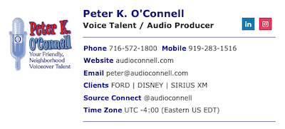
The new email signature from Wise Stamp now used by voice actor Peter K. O’Connell

For some years, I had an email signature with links that I got via Wise Stamp, a company that provides a multitude of plans for email signatures for individuals or companies with scores and scores of  employees. The services for many of these plans can get very involved (think tracking of email opening, lead generation, etc) and with every additional service the cost goes up.

I’ve just used the basic Wise Stamp email signature templates with links, in the past. I liked it because to was always formatted correctly, it worked well with Outlook and GMail on sizing, it didn’t seem to have a problem working on the various email platforms of anyone receiving my emails (they need to be able to read it, after all) and the customization was variable, attractive and easy. It was also of course not free – unless you wanted Wise Stamp branding on your email sig (which was *verboten* in my marketing brain).

Although not free, Wise Stamp usually had a discount price offered so it made it OK. When they dropped the discount over a year ago, I went over to Canva.

The link issue, however (as I mentioned earlier), was becoming something I thought more about. Gnawing at me.

Wise Stamp recently had another discount offering (not as good as in the past)…but it had links. Ok.

So for the next year, I’m going to see if I sleep better with links in my email signature.