Share
Proving yet again that in some ways I am a day late and a dollar short on my tech knowledge (shoring up some tech specs on this blog would be one short coming I am still currently working on…Bob Souer, don’t give up on me yet!)…I humbly introduce audioconnell.com’s newest attribute, our Favicon.
Not to be confused with Flavor Flav, I am only hoping there are at least a few of you who quizzically furrowed your brow at that word. I didn’t know it existed until a few minutes ago myself. I only knew it by its original Latin name: Logo to the left of the URL.
Pronounced fav-eye-con, it is short for ‘Favorites Icon.’ A Favicon is a multi-resolution image included on nearly all professional developed sites. Within Internet Explorer the Favicon is displayed on the Address line and in the Favorites menu. The Favicon allows the webmaster to further promote their site, and to create a more customized appearance within a visitor’s browser. Often, the Favicon reflects the look and feel of the web site or the organization’s logo.
So now I’ve got one. Frequent visitors will even say “well, you had one when you first re-did the site”, it was a smooshed version of the company “microphone” (RCA-77 for the microphone aficionados in the audience). But it looked, well, like crap (are we allowed to say “looked” on voice over blogs?) Anyway I needed to change it.
Well have you ever tried to change an easily read or identified image to a 16 pixel x 16 pixel version? It’s hard and it looks bad. I was lost for any ideas on how to make my favicon look good and mean anything.
Fate interceded as it always does. I had been working on some embroidered swag so that I might like a voice over talent turned NASCAR fan at networking events (of which I attend many…networking events not NASCAR races). I used the main audio’connell Voice Over Talent logo and sent it to Land’s End Business Outfitters because I always like their clothes, how well they wear and I had had some stuff made there years ago and it was great. Some things don’t age well, however, and the logo makers and managers at LEBO really didn’t do a hot job in my opinion. The shirts I had made were ok (just ok, embroidery was so-so) and when they tried to tackle the baseball hat, their embroidery wheels seemingly came off completely.
So after two months of what I deemed mostly unsatisfactory results, I went to my friend and past client Cindy Miller. Cindy’s name may be familiar to you for a number of reasons: she’s a former LPGA tour player and she’s been seen often on the Golf Channel’s Big Break III: Ladies Only. She also holds golf clinics, gives lessons, gives keynote addresses and, with her husband and former PGA Tour Player Allen Miller, owns an embroidery company called Tee Shots.
In answer to your question, you’re right, I should have gone to her in the first place, I know, don’t remind me. Let me get back to how this relates to the Favicon. So I am talking with Cindy about this hat thing and she says why don’t you try something different with the hat, something a bit eclectic. So I put on the old thinking cap (which I likely won’t wear as much after I get the new baseball caps) and played with ideas.
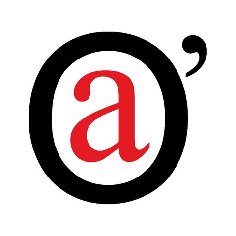
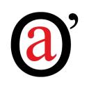
The idea struck me that I should create an icon that could be like a secondary logo, something you often see NHL teams (like the always exciting Buffalo Sabres, who’s new, main “mullet” buffalo logo I dislike intensely) use on their jerseys; they have their main logo and then a secondary icon. I wanted something cool, unique, maybe a bit more modern than my current logo which I also designed. I settled on the red “a” in the audio’connell Voice Over Talent logo encircled by an “O” with an apostrophe. Then I realized, if it can work for a hat, it could work on my “Logo to the left of the URL” too.
And so it was born. Ann Hackett from aHa! Designs helped bring my idea to life.
Tonight, I checked on Google to see if there was a name for this logoed doodad and found out about the Favicon. I may yet refine the graphic a bit cause it looks a bit jagged, but over all its what I wanted.
So thank you Favicon, you are a subtle branding reminder that great things in marketing are sometimes very small.
Tags: advertising, commentary, internet, marketing, silliness, technology by peter k. o'connell, your friendly, neighborhood voice-over talent
5 Comments »