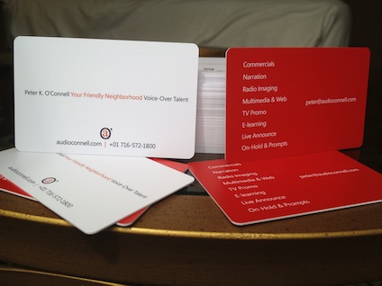
the new business cards
I’m not sure if it’s true for every FaffCamper or FaffConite but for me, when I see a Faff-event coming up in my calendar, it becomes a goal…a kind of joyous finish line for some of my marketing plans (you know, a marketing plan…it’s that written document that you need to…oh never mind).
As you know from past blog posts, I had a plan to redesign my business cards. I’d decided that FaffCamp would be the perfect deadline to have these cards ready…not really for the Campers, many of whom I’ve known forever, but for the Monday AFTER FaffCamp, so I’d be ready with the renewed marketing vigor that FaffCamp will imbue within me. The response of the recipients of these cards will be the true test of their efficacy…but I gots me a plan for that!
Branding-wise, I wanted to put a greater emphasis on the “Friendly, Neighborhood Voice-Over Talent” positioning that I created. audio’connell Voice Over Talent is still very much around but this freshening of my personal brand felt accurate from a variety of marketing perspectives; among peers and clients, the branding is getting positive reviews.
So I toyed around with some graphical ideas for the positioning and hit upon a look that I believed conveyed the feel of what I was trying to communicate while still staying true to the family branding equity that audio’connell has established for all these years. I’d focus more on audio’connell’s secondary logo mark (the “a.o.” as I call it) versus the full microphone logo to tie in with the positioning statement and new word mark.
Now in the world of business cards, I have a reputation to uphold (can you see how puffed out my chest is getting –no, it’s not some kind of allergic reaction)…after all, I get calls from clients and friends asking me for help with THEIR business card designs, so mine had better be pretty unique.
I liked the word mark design because it was minimalist (unlike my personality) but on a business card, that same quality that I prefer might just kinda sit there. While wondering (like, for months) what I was going to do to make this card stand out, I got my answer while recording at a studio in Toronto.
I committed a robbery in broad daylight AND in another country, no less.
Right there in the studio’s card holder on the reception desk: thick, heavy plastic card stock for a business card. Full color, two sided. Oh yeah.
The message via these cards to the creative community that I serve (agencies, production houses) is subtle, tactile and memorable. And it tells my story.
We talk about look and feel when we talk about design – I think (and maybe egotistically) these cards have a creative, professional and friendly look to them but their feel is substantial, durable and dependable. It’s a lot to ask from a card – but I believe it gets my branding and personal message across well.
Communication though is NOT in the transmission, it’s in the reception. You are welcome to give you pro or con opinion here on the new cards…but just know that I’ve got a lot of these new cards so if you hate them, you’re going to have to hate them for a while. ☺


I love them Peter. Hope they serve you well and help bring in sacks of the green stuff. Have fun at Faffcamp. I am already missing everybody there.