voiceover business card story
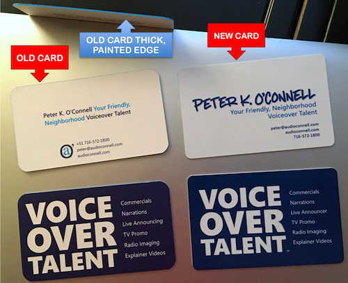
Over the weekend, audio producer Brad Newman was evidently looking at all the business cards he collected at FaffCon 9.
He saw that I had not one but two new business card designs.
He posted a picture on social media and it started a discussion because folks had questions. Why the two cards? Why the different designs? Why didn’t Minnesota beat the Yankees in the wild card series? Lots of questions.
So I thought I would do a quick overview on the two cards which will also bring you up to speed on my marketing changes (if you’re some kind of marketing stalker).
OLD CARD
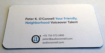 The relatively cheaper old cards were crafted while I was trying to get some new, fancier cards made
- My original goal was to update all my voiceover branding since I moved to North Carolina; I would adopt the dark blue light blue scheme that was a tip of the hat to the University of North Carolina’s color scheme (not exactly like theirs but in the family)
- I also had a graphic idea for really highlighting the phrase “Voice Over Talent” and explaining the type of work that involves (because I’ve had to continuously explain what a voiceover does for 35+ years)
- I was trying to do a plastic card, as I had done before with cards I did while in Buffalo, but my old vendor screwed up the new blue design TWICE and after that, he got fired
- You’d be surprised at what a complete pain in the butt it is to try and RGB and PMS color match light blues – ridiculous
- For the old cards, I found a vendor who did the thick paper cards who also painted the sides
- He could not do a PMS color do I got stuck with that crazy bright blue
- The weight of the card was really nice as was the painted edge
- As nobody else was going to be as bothered by the color situation on the old card as I was…I lived with that old card for a while
As time went on, I knew I wasn’t happy with the old card and, even more so, with the word mark itself which I felt needed help.
As much as I liked the word mark font on the old card, the full word mark did not make the brand name (which happens to be my name) stand out. I wanted a font for the brand name that looked personalized, which would then be supported by the tag line in that font I used on the old word mark.
I could have tried actually printing my name and making that part of the logo, except my printing Sucks with a capital S.
So I look at thousands (truly thousands) of hand script fonts that conveyed friendly, fun and masculine.
Trying to find a masculine looking hand script font that also doesn’t look like it was written by some kind of angry demon is not as easy as you’d think.
Remember, I was trying to convey friendly to support the tag line “Your Friendly, Neighborhood Voiceover Talent”. Worse some of the “male” based script font sure looked awfully girly to me and many of my voiceover peers, whose opinions I sought throughout this process.
Two things then happened kind of simultaneously. I found the font I really liked for the brand and I found a new vendor for printing the plastic cards. It would look good but it would not be cheap.
NEW CARD
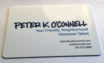 Working with the new brand font and old tagline font within the blues color scheme, my designer came up with the logo idea of making everything flush right…I thought it worked really well, so I carried that thought through on the front of the business card where everything is flush right
- I tried to make the font sizes bigger….small font size may be cool but readability is where it’s at for business cards and my eyes are getting old – bigger font size and a bit bolder
- My designer also PATIENTLY helped me narrow down my PMS color choices…she deserves combat pay for babysitting me through that debacle
- I really liked the way the back of the card (all dark blue with white VOICE OVER TALENT) worked on the old card so kept it on the back of the new card
- The card size as you may have noticed is bigger than the old card…it is credit card size
- I added a clear coating on all the front and on the white VOICE OVER TALENT…really makes a nice impact
So then why did I bring two sets of cards to FaffCon? Well I didn’t really. I brought mostly the old cards to distribute because I wanted to get rid of them and my peers aren’t likely to be as impacted by my card design as real prospects. I handed out a few of the (expensive) new ones to a few Faffers.
Now you know more about my business cards than you ever wanted to…hope this helps.
 Ok, well there’s actually nothing to win but certainly check your mail!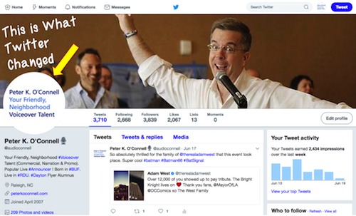
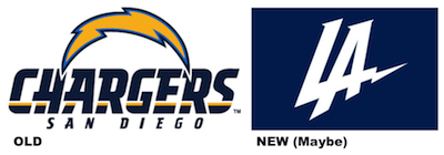 Let me be clear, I really like the city of San Diego. I would consider living there if only the city was not in the state of California.
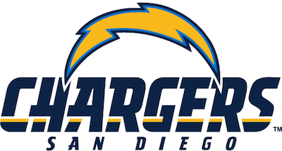 Now, to begin with, the Chargers, late of San Diego, seem to me to have lost a bet when it came to logos and colors. Certainly, they didn’t have as bad a situation of it as the Cleveland Browns, but logo and word mark wise, the Chargers could certainly do better with the move to LA and a new icon.
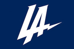 The logo roll out (such as it was) gives you a pretty fair indication of what kind of operational chaos the Chargers of (pick any city in California, I guess) are in.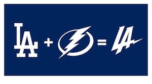
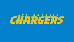 Then, for reasons that I perceive as panic driven because of the poor reception given the Los Angeles Chargers “Fiver Logo”, the team went back to their horrible word mark with yellow/goldish lettering on a light blue background about 24 hours later. They must have called the “braintrust” at the Los Angeles Rams for advice and were told, go back to your old imagery and just change the city name.
 In other sports news, the Oakland Raiders (it seems) will be moving to Las Vegas in a few years. Hope their new logo is better than the horribleness that is the name, branding and worst of all colors for the Las Vegas Golden Knights. Ick!