Entries Tagged as 'silliness'

i look taller in real life…but not much

Peter O’Connell, Voice Over Talent, headshot

Not one to shy away from blatant, crass commercialism (what commercial voice talent would?), I have been Simpsonized for your viewing pleasure.

The home of the Whopper® has sponsored this little device that supposedly takes a picture you submit and reproduces it in the style of a Simpson cartoon.

The movie employees voice actors so I suppose their is some connection to this blog.

Well, they got the hair right.

guardian angels or microphones in the car?

Etch-A-Sketch Art. All copyrights acknowledged.

I’m not sure how this all works….whether it’s God, the cosmos, Guardian Angels or if someone is following me around with a microphone. But it seems as soon as a topic of interest comes up in my life or I think I have an understanding of something, some how I gain new insight or information from a totally unconnected source. It’s weird; here’s what happened.

This weekend my wife (or as David Feherty refers to his wife in his columns “She Who Must Be Obeyed”) and I got to talking about Etch-A-Sketches. The knobby drawing device many of us had as kids (I think we were talking about toy options for our child). She mentioned what a useless toy that was because she could never draw anything worthwhile on it. I wholeheartedly agreed as I couldn’t draw much on it either. So we agreed we’d never buy one of those useless Etch-A-Sketches.

(Stand by for a lesson in social media. Count the connections and also see how new connections are made. It’s a fun game with no height requirement )

Fast forward to today’s early morning review of the Google Reader and I pop in on Mitch Joel’s blog on Podcamp Singapore (that guy does all the cool stuff). In Mitch’s article, he referenced a blog by Andy Nulman entitled POW! Right Between the Eyes (which is as great a title for a blog as I have come across…content to match.) On Andy’s blog he writes about an Etch-A-Sketch artist who really knows how to turn those knobs.

OK, so “She Who Must Be Obeyed” and I were not so much wrong, it turns out, just both terribly Etch-A-Sketch challenged. The talented artists who create on their red canvas are really terrific! We’re still going to hold off on getting the Etch-A-Sketch because while she has proven to be a great artist in the Crayola world, the baby is clearly at a genetic disadvantage on the Etch-A-Sketch front.

judging your internet brand

perfect 10

Traveling along the internet super highway (which sounds more impressive than what I was really doing, which was scanning my Google Reader for updates) I came across this certainly less than scientific way to judge one’s internet brand presence.
I started with my main web brand: Peter O’Connell.

My score? A perfect 10 for 10. I figured I’d best stop while I was winning.

What’s your score? Enjoy.

audio’connell in boston

voiceovers in Boston

While on business for the past week in Boston, I had the opportunity to visit with my voice over colleagues Deirdre Cooper and Mary McKitrick who live in the area. “Area” is a vague term because both were at least 90 minutes away from my location near Boston Harbor.

But bless them both, they took the time to travel and have dinner with me in the city and boy did we have a grand time. I’ve known them both “virtually” for some time on the VO-BB and through some voice projects that we’ve collaborated on.

It is said you can’t really know someone until you’ve spent some time with them and these two voice actors are great ladies in addition to being amazing voice talents. While one might imagine conversation coming easily to people who talk for a living, our conversations were the very definition of effortless, full of both professional insight and shared challenges. Social networking at its finest.

There is no 12-step program for voice over talents because we can call our shared addiction a profession, but it’s nice to be able to discuss similar trials and tribulations with people with whom you can both commiserate with and learn from. And I’m not sure who was the first to pull out the pictures of the family first (usually I’m guilty on that count) it was very funny to learn again how parenting challenges are universal.

My sincere thanks to them for taking the time to become my friends in addition to my colleagues and making Boston an even more hospitable place.

it’s time to stumble upon

stumbleupon.com logo

TV was at one time considered the penultimate time-waster. The “boob-tube” was where one went to zone out (translation/clarification: for people who were too much of a boob to read a book or be active….a modern colloquialism has changed the term “boob” to mean something not intended here).

It stands to reason, then, that as TV loses its strangle hold on viewers, the main culprit leading people away from television would itself create its own special time waster (no, no…the internet itself is not a time waster). The internet’s relatively new and certainly more popular eye candy is called Stumble Upon .

Based on votes, unique and popular web content (sites, particular pages etc) in fields of interest chosen by you (the viewer) will pop up on your screen with the press of a button you have installed on your browser’s tool bar.

It is a fascinating look at some amazing content that, unless you spend a lot of time surfing specifically for such things, you simply won’t come across anywhere else.

Purely as research (ahem) I have compiled a few sites I found on Stumble Upon that interested me. I hope you will too.

By the way, as you’ll notice in the icons posted beneath this story, you can vote for this blog story as worthy of “Stumble Upon” by clicking on the SU logo.

Enjoy!

25 Great Calvin and Hobbes Strips

Five Lesson About How To Treat People

Buddy Networking

Computer Enhancers

The History of Branding

Telling Time in A Different Way

The Art of Schmoozing

South Park Create A Character

Another Cool Way To Tell Time

The Pattern Game

Learning Sign Language

Storms

Type Tester (picking the right font for your web site)

The Blue Ball Maze (Note: avoid this if you are on some mind altering drug)

a logo flop of olympic proportions

2012_london_olympics_logo

Some things just strike me as funny.

That includes the minor misfortune of others and in this case, the “others’ happens to be the citizens of London, England.

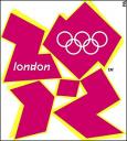
London, you see, is home to the 2012 Olympic Summer Games, which I have no doubt will be a smashing success as Olympics go…great athletic achievements, dramatic stories of accomplishment, amazing new venues and some boon to the UK economy. All of it very impressive and deservedly so.

Except for the logo.

Every Olympics has a logo. Without it, you can’t sell Olympic t-shirts and mugs and hats and cups and lighters and bookmark and underpants and baby bibs and earrings…all of which add up to a sizable revenue chunk in any Olympic budget. So the logo has to evoke something positive about the Olympic experience, the flavor of the city the Games are being held in and ultimately be attractive. Or at least not unattractive. Or at least not suck.

Oh my but does the 2012 Olympic Summer Games logo suck…on a global scale.

The committee in London, led by Committee chairman and former British distance runner Sebastian Coe, paid the design firm of Wolff Olins over $800,000 to design the logo that all of London and eventually the world was to embrace and promote.

Except London didn’t embrace the logo. They hated it.

A BBC on-line vote with nearly 11,000 votes cast showed 85% hated the logo with 4% saying they really liked it. When introducing a new brand, these are NOT the numbers you hope for.

Need a few more facts?

This design, which comes in a variety of color schemes, when animated caused 10 people to complain about the animation of logo because some of them suffered seizures when they saw it on the official Olympic web site.

Are you going to buy a logoed product that may cause seizures?

Bless the government’s leaders as they stood by this awful design. Outgoing Prime Minster Tony Blair said “When people see the new brand, we want them to be inspired to make a positive change in their life.” Maybe it’s me but I don’t see having seizures from looking at a logo to be a positive change in my life.

The London Olympics branding web site has a gallery of “civilian” logo submissions and I think there are plenty in those galleries that would been a much better branding icon than the $800K klunker.

As an icon, there may be been uglier or dumber looking images, but from a branding stand point, London’s Olympics are not starting out well.

From a humor stand point, they are starting out great!

My advice for this logo or any others going forward can be summed up in two words: focus groups.

P.S. Here’s a link with some other more attractive logos (I especially liked the Paris logo…I think that would have been a huge hit, you know, had they…won the bid).