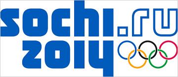
here is your sochi 2014 winter olympic logo

Official logo of the 2014 Winter Olympic Games in Sochi
Despite reports to the contrary, this is the new, official logo of the 2014 Winter Olympics in Sochi.
I am still taking this all in as the new Sochi 2014 logo has just been revealed to me. Here, I will write me thoughts on it as they come into my head (get ready for a bumpy ride in there):
> Unexpected
> More a wordmark than a logo
> Kinda 80’s
> Less iconic
> Different
> Domain name in the logo
> Not as bad as London’s logo
> Sometimes different is good
> Liked how they laid out the subtle crystal imagery in shoes, uniforms etc.
> Subtle
> Unique
> I could grow to like this
The blue and white Sochi2014.ru wordmark, which Interbrand created and Moscow introduced on Tuesday, is the first major international sports logo to include a website address. Sochi.ru appears reflected atop 2014 with the Olympic rings below .ru, the Internet code for Russia.
I think what makes the new logo work most for me is having the domain name in the mark. That recognizes where we are as a world and where we are going in a very profound way. More than branding, to me, that’s an important statement.
Not having an icon within the logo and instead using a crystal effect will require a stronger communication effort of the committee’s part.
I am not sure if they will create a mascot for these games, as has been done in the past. It’s possible organizer’s plan to use that mascot as part of the icon, but that’s just conjecture on my part.
Having personally really liked the Sochi 2014 bid logo, I was kinda hesitant with this word mark. But Russia is trying something very different and I think we have to respect that. It certainly does not evoke within me the complete distain I have for the London 2012 logo mark.
I’m not a fan of their national politics but the Olympics are not supposed to be about politics, in spite of the fact that the country is blatantly saying they are using this Olympics as a way to brand the new Russia. Honestly, that is one of the main reasons every country wants to host an Olympics ‘come see us, we’re not so bad, let’s stay friends after the Games are over, maybe we’ll do some business together.’ There not a hammer or sickle in sight (the icon of the USSR to which Russia is most often associated) and they only red in the logo is the red circle of the Olympic logo. Sometimes it’s what is omitted that sends the biggest message.
Or maybe I’m reading too much into it.
Now that I have totally skewed your opinion of all this, I hope you’ll still share your immediate thoughts on the new Sochi 2014 logo.


[…] This post was mentioned on Twitter by Peter O'Connell, Charlie Riley. Charlie Riley said: RT @audioconnell: here is the sochi 2014 winter olympic logo: http://ping.fm/1WcCY Not sure what I think about it… […]