just to see…
Posted on October 26th, 2011 by peter k. o'connell, your friendly, neighborhood voice-over talent
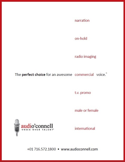
This is a copy of a recent audio’connell Voice Over Talent print ad I designed for an association newsletter I had space in – whaddya think, clean and crisp or too artsy with no real message?


A bit sparse, but I like negative space. You have a closing quote symbol with no opener though…