
lamest radio station logos
![]()
There are many things that frustrate me about the current state of radio. But one of the things that drives me the most crazy are some of the absolutely not attractive logos that radio stations come up with for their formats! The stations are probably great but what’s with these logos?!
I want YOU to send ME your least favorite broadcast (not internet or LPFM) radio station logos. I will post them here (for fun only – we’re not trying to cause problems here). Let’s try and keep them modern – these would be active radio station logos – nothing from decades past, in other words. Send your files to peter at audioconnell dot com.
These are logos that it seems somebody created on their PC or had their child create on their Etch-a-Sketch or that somebody pasted together without any professional, graphic sensibility at all. They are unworthy of the great station they represent and should be re-designed. These station very likely sound better than they look — they need better visual branding and maybe this blog post will help encourage the stations to do that – or maybe this post will be as ignored as all the others posts :).
But of course ugly is in the eye of the beholder and since it’s my blog, I will be the beholder and thus the final arbitrator of whether a radio station logo is truly unattractive enough. Maybe with some professional focus, these stations can get a logo that’s a bit more attractive – something nicer to slap on the side of the station van. So in no particular order, here we go…

WYDB/Dayton, OH (2014)
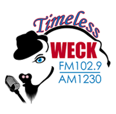
WECK/Buffalo, NY (2014)
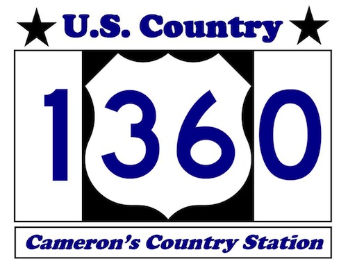
KMRN/Cameron, MO (2014)
KKVS/Las Cruces, NM (2014)
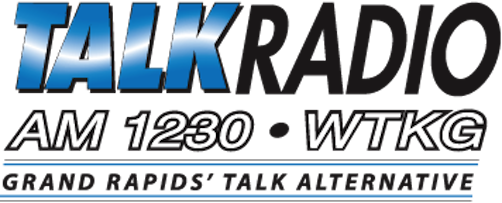
WTKG/Grand Rapids, MI (2014)
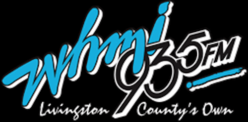
WHMI/Howell, MI (2014)

WKXW/Trenton, NJ (2014)
