
sometimes you do it just cause it makes you happy
IN VOICEOVER and in many other industries, our websites are our store fronts.
Because most of us work out of our homes, we don’t see much street traffic – although clients do come over to the house to record from time to time. It’s a great way to force yourself (or my children in my case) to clean the house.
So we as voice actors try to make sure we make the web site SEO friendly, make sure the menus flow well, make sure the content is informative, timely and fits our branding message. Of course, we want it to be attractive and inviting as well.
Some more obsessive website owners (whomever they might be and they might have an apostrophe in their name…or not) are always looking for unique and sometimes very subtle ways to gain a viewers attention or peek their creative interest by showing something visually (as well as ‘audiolly’) cool.
And then sometimes you include something in your voiceover web site just because it makes you happy.
Truth be told, THAT’s the reason I included the above graphics on my voiceover agent page on my web site.
Some will look at the page and this blog post as a way for me to be bragging about my agents…I can only tell you this post is sincerely not meant that way. I wanted to share with you the creative process I went through to create this in hopes that maybe it will spur you on to create something new and unique to your own web site, something unique and specially that you hadn’t thought about adding until reading this. Onward, then.
The idea started thusly…
I was looking at other voice talent web sites for a completely different reason and noticed a voiceover agent page that featured logos of that’s talent’s agents. Many of us try to include our agents on our web sites to give them recognition and possibly leads for those folks who prefer to book voice talents not directly via the talent but rather by an agent. Fine by me!
In a previous incarnation of this page, I had included a graphic of agency logos but I thought it got too busy and for a long time, I have just listed text.
Well today I went back to the idea of trying to squeeze in small logos from each agent next to their text listing. But it ended up looking forced and some of the logos were…well let’s just say some agents aren’t graphic designers and leave it at that (yes I am a snob about such things — with no credibility to judge anyone). Oh and many agents have very nice logos as well. Bottom line with my agents, they are good business partners and that’s what I sincerely care about.
But I wanted to create a way for the agent page to stand out a little more and be visually interesting to the reader.
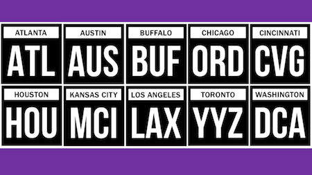
 Since logos weren’t going to work, I had to consider a unique, common theme. I thought about geography, then cities, then how people know cities, then how cities have nicknames, cities have abbreviations and then…..codes! Airport codes!! Of course!!!
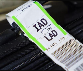
As you know, I am in airports all the time and I often refer to cities by their airport codes. It annoys my family sometimes but I come by it genetically because my frequent flyer Da did the same thing. So there is that memory fueling this idea too.
Most of my clients are business owners and many of them travel so there should be an immediate familiarity with this look and feel as well.
So keeping with a generic format, I used no unique colors rather just a simple, understated, functional and a bit elegant look…at least in my head.
Maybe nobody will notice this except me…and now you because you read this (thanks for that, BTW).
But it’s kind of like those studio knickknacks we all have or that special picture or piece of children’s art you keep.
It just makes you happy to have them and that’s reason enough to keep them.
Until my next idea, anyway.
