
THE VOICEOVER EXPRESS INTERVIEW:
“Voiceover Branding with a Smile: A Conversation with Peter K. O’Connell, America’s Friendly, Neighborhood Voiceover Talent”
Interviewer: THE VOICEOVER EXPRESS
Guest: Peter K. O’Connell – Award-Winning Voice Actor, Voiceover Coach, and Business Owner
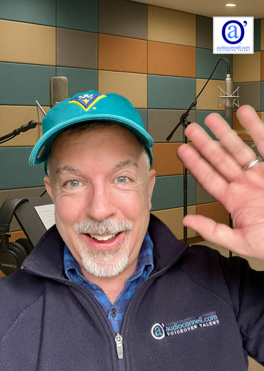
Male Voiceover Talent Peter K. O’Connell
From global brands like General Electric, Kraft, and Deloitte to countless eLearning, commercial, and narration projects, American male voice actor Peter K. O’Connell has become one of the most trusted American male voiceover talents in the industry. With a voice that exudes warmth, confidence, and clarity, O’Connell has spent over 40 years building not only a successful, award-winning voiceover business but also a brand that resonates with audio producers, creative directors, casting agents, and media pros around the world.
But a great voiceover career isn’t just about the sound — it’s about getting the business, and branding is critical. We sat down with Peter to have an open, honest conversation about how he’s approached voiceover logo design over the years and how it plays into his marketing success as a professional male voice actor.
The Voiceover Express: Peter, you’ve been known for your tagline “Your Friendly, Neighborhood Voiceover Talent.” Where did that come from?
 Peter K. O’Connell: It started as a fun nod to the comic book world, but it really stuck because it represents how I work — friendly, reliable, and professional. Clients often look for a conversational, natural, and trustworthy voice. That tagline says it all without being stiff. Then, over time, I realized my brand had to look as friendly as it sounded.
VOE: You’ve redesigned your logo a few times. Why change it — especially when you’re already well known?
 O’Connell: Fair question! I think logos evolve over time for a number of reasons. In my case, who you are as a performer and what the marketplace is looking for as well as the tools they use to find your services will dictate to some extent your look and messaging.
I had the kind of elegant audio’connell branding for a loooong time. It was perfectly fine…maybe not flashy but serviceable.
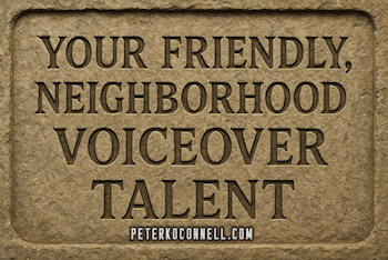
A version of the Peter K. O’Connell Your Friendly, Neighborhood Voiceover Talent logo modified for the male voice actor’s 40th year in voiceover
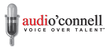
The first major voiceover logo update was in 2016, right after I moved to Raleigh. I wanted my branding to reflect the new environment — so I dropped the red and black for blue tones more common across North Carolina.
But also, producers weren’t always connecting the audio’connell company name to Peter K. O’Connell, the voice talent. They’d ask, “Who does the actual voice work?” Um… me! So I made the “Peter K. O’Connell” part of the logo branding more prominent in the 2016 version.
That logo version evolved over time from a more rectangular shape to a more square shape, guided alot by logo placement and usage on social media. I also had a little fun with that logo during my 40th anniversary as a professional voice actor.
VOE: The voiceover logo tweeks following your family’s move from Buffalo, NY to Raleigh, NC make sense, a kind of logo refresh for a fresh location. But why the logo refresh in 2023?
O’Connell: I’m not sure whether to call the branding change of 2023 branding “humility” or “humiliation” but it was certainly all self-inflicted (much laughing). The more I looked at the 2016 logo, which I liked and it worked well, the more I thought how uncomfortable I am with my name so big, so bold, so prominent. It was the logo I created to serve the purpose of putting my name out there, getting recognized, looking professional and creative – it did all that, especially according to people more graphically talented than me…but it was starting to make me feel very… self conscious.
Look, I’ve always had a problem with self-promotion…. in essence, me “branding me” and “promoting me” or “publicizing me”. ICK!!! But I do it because I have to — all voice actors have to. What we are selling, as voice actors, is ourselves. But I have never done the public relations, direct mail or social media because I want to…truthfully, such required promotion is awkward and embarrassing to me personally.
VOE: So the 2023 logo refresh was a reaction to that awkwardness?
Yes and, look, maybe it’s a good lesson for any small business owners to check your feelings versus reality when it comes to your branding. In 2023, my gut was wrong.
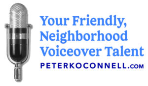
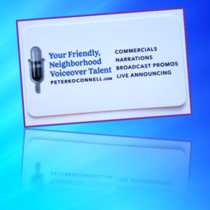
The rest of the world did not look at my 2016 logo and say “what a pompous, egotistical jerk Peter is”…I gave the world many OTHER reasons to say that, having nothing to do with my logo (much laughing). But I went ahead with focusing the logo on my tag line “Your Friendly, Neighborhood Voiceover Talent” with the peterkoconnell.com tagline and brought back the RCA-77 microphone.
The new 2023 logo was subtle. So subtle it might show up on an EKG as a flatline. DOA. (much laughing)
VOE: The latest version launched in 2024 — what changed?
O’Connell: I knew that for a company of my size and scope, certainly logos are important…but they are rarely sacred.
I realized my error with the 2023 logo and knew I needed to start fresh in the new year.
Important to note – it’s OK to make mistakes as a micro-business owner but it would have been unwise not to learn from it and move on.
Having digested my logo humble pie in 2023, I thought about the previous two logos, about what I liked and what I didn’t like about them. I needed to come up with a plan. Clearly, the 2023 version wasn’t nearly friendly (or interesting) enough and the 2016 font style was…I dunno, I guess I’ll call it too stylized, too “big city” and again, not friendly enough.
![]()
So I was fumbling around with fonts one night, sincerely not thinking about the logo at the time (isn’t that always when inspiration strikes, right?), I came across a font that made me think of the font style in the credits of the movie “Mary Poppins”. Young or old, Mary Poppins usually represents happy and friendly. I think so, anyway.
To me, the font was fun but not childish or comic-book based but it had….personality! It was a creative, friendly and I feel professional way to present “Peter K. O’Connell” (while also dropping the “look at me” all caps look of the 2016 logo…maybe the caps were the problem all along, I dunno, ask my therapist if I ever get one).
Then I found a font for the tagline that I felt really properly represented the friendly, conversational message within the tagline “friendly, neighborhood voiceover talent”. I decided to keep the iconic RCA-77 microphone on to which I subtly tied in my well-liked audio’connell icon. The red and light blue came from a mix of personal ties — my college (University of Dayton), the Buffalo Bills, and some local schools here in North Carolina.
No one is going to confuse this voiceover logo for a branding masterpiece but I believe the logo DOES say fun, creative, friendly and unique. I feel very happy and at piece with the look and how it represents me to the voiceover marketplace. I’ll let you know in a few years if I still like it. (laughs)
VOE: You’re a voice talent, not a designer. Why get so involved in your voiceover logo design?
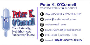
This is the Canva designed email signature used by voice actor Peter K. O’Connell
O’Connell: I may not be a designer – strike that, I am not even close to a professional designer – but I care deeply about how clients perceive me. So while I am smart enough to have a professional designer execute the final work, I present my designer with developed concepts and direction that gets her to where I want to go (unless she tells me no and I will listen to her advice). But with the competitiveness of voiceover today, I need all my marketing efforts to stand out, including the logo. When a potential client sees my brand on my web site or social media when they search online for male narration voice, corporate voiceover, eLearning voice, conversational American voice talent or whatever, not only should my website and voiceover demo information come up but the visual identity I have created also needs to engage them with a super positive, professional, trustworthy first impression. Those are the outcomes I NEED to come out of a design project and that’s why I am involved.
VOE: For those just starting out — any marketing or branding advice?
O’Connell: Do as I say, not as I do. (laughs) My advice is know that marketing, at the highest corporate levels, with all their focus groups and statistics and big budgets, will never be perfect…so don’t wait for perfect in your small or micro-business. But also, don’t wait to take action. Take thoughtful action after doing your due diligence and execute. You will make mistakes but stay calm. Most people won’t notice the errors unless you announce your mistakes in an interview like I just did. (much laughing). Then specifically for voice actors, know who you are and what that uniqueness is that you bring to the mic. Whether you’re a deep male voice, a friendly commercial voice, or a credible narrator, reflect that in every part of your brand — including the visuals. Your logo is the silent part of your voiceover demo — make sure it speaks just as clearly.
Find Peter K. O’Connell at peterkoconnell.com — or just search “friendly American voiceover talent.” Chances are, Peter will be the voice you’re looking for.
Tags: commentary, voice talent, voiceover, voiceover advice, voiceover logo // Comments Off on THE VOICEOVER EXPRESS INTERVIEW:
“Voiceover Branding with a Smile: A Conversation with Peter K. O’Connell, America’s Friendly, Neighborhood Voiceover Talent”
