Entries Tagged as 'branding'

sightseeing at ORD

Usually changing planes at O’Hare International Airport in Chicago is not terribly exciting. Sometimes it is terrible but again not terribly exciting.

Not so today.

I came across two unexpected marketing executions, one expected but not seen (maybe this is a world exclusive?) and the other unexpected and very impressive.

This is MY first look at an actual post merger United Continental Airplane design. I really didn’t think these were going to be ready so soon but what do I know! 🙂 I will say that as of this writing, the United web site still has their old branding sans Continental’s blue and gold.
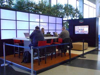
This is an incredibly cool and BIG sale brochure 😉 for Courtyard Marriott highlighting their newly designed lobbies. That is a FULL video wall along the one side and what I believe is an interactive video screen on the side. Anybody cruising through gates B and EF will see this and it is an impressive sight.

See, traveling doesn’t HAVE to be tedious.
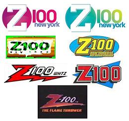
Z-100 new york gets refreshed

Logo Montage of Z-100 New York

If you worked in radio in the 80’s, WHTZ/New York was the station that every CHR station (Contemporary Hit Radio) wanted to sound like.

It was where the cool kids hung out. Jingle companies fawned over them tossing them completely new customized and awesome jingles because they knew they’d make their money when every other station in the free world bought them for top dollar. See if these these don’t sound familiar to a market near year where only the frequency and slogan are slightly modified.

My point is once a trend setter, always a trendsetter…until you’re not. Z-100 still turns heads although the 80’s also-ran WPLJ-FM took the lead (and Scott Shannon) away to even things out a bit.

So when Z-100 changes its logo, unlike other radio stations, it matters a bit. You are more like to see those top two logos pop up in other cities around the country – radio as an industry is inventive, once. Then its copy city after that.

So what do you think of the new icon? Or do you have to hear the station to see if it fits?

The playing field is a bit more level today then it was when I was working as a jock but don’t be surprised if you start seeing similar logos to the top two in the graphic above in your market soon. Once a trend setter, always a trendsetter…until you’re not.

new network, new logo

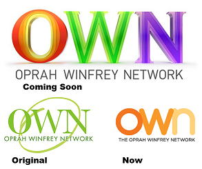
Technically, you could rightly say: “not a new network”, because The Oprah Winfrey Network has been around a while. But when the billionairese decides to fold up shop on her 25 year old talk show to focus on her network, certainly one can be assured new blood is about to be infused into the broadcast.

So with such an infusion comes a bigger focus on branding which usually means a new logo and there it sits.

As always, remember that a TV logo stays static only on the stationary and that I’m guessing they have loads of movement and animation ideas for this concept.

Your thoughts? You like? You dislike? Did Oprah hit a home run on this logo or did she merely rob a paint store?

just forget this ever happened

On the left - the old-new logo. On the right - the dead logo

OK, see last week Gap Stores changed their logo. If you have any kind of life, you probably didn’t even know this.

That was the story…until the story became how much everyone hated it.

No, I don’t mean didn’t like it, I mean hated it.

Then the company said it was an ‘evolutionary’ logo – not exactly a vote of confidence for the logo design team.

Then the corporate folks said they’d take suggestions from the public.

Then they corporately said “screw it” and they went back to the original logo.

There is probably a huge marketing lesson in there somewhere.

I prefer to believe that it was simply common sense prevailing.

That is all….for now.

because there hasn’t been a logo post here in a while

I came across this video produced by the design firm Chermayeff & Geismar. It’s really impressive.

It takes some of their most famous logo designs (and there are lots of them) and morphs them into a cool video montage. The video has been around a while but its new to me so maybe its new to you too.

Not only is it entertaining but it’s also effective marketing although by the looks of their clients and their great work, you’d think securing new business isn’t so much a problem.

podcamp boston september 25-26, 2010

The one that started it all, Podcamp Boston, will celebrate its fifth anniversary this Saturday and Sunday, September 25 & 26, 2010 at the Microsoft N.E.R.D. Center (yes, you read that right).

That’s the good news. The bad news is it looks to be sold out and there is a wait list for tickets. So I guess blog posts like these for their event don’t seem so necessary anymore.

Well, good luck to all involved anyway.